





How to Use Data to Tell Compelling Stories and Win New Deals

4507
Of your peers have already read this article.
2:30 Minutes
The most insightful time you'll spend today!
A picture is worth a thousand words–especially at work. The data we present every day is what helps us drive decision-making in the workplace. But understanding how to visualize a story can be difficult if you’re left staring at numbers sitting stagnant in rows or columns within a spreadsheet.
This is where visualization with charts and reports becomes critical. Let’s say your team needs to understand global sales trends. If you have a waterfall chart that shows regional contribution to total revenue or a scatter plot that shows individual salesperson performance, it’s much easier to spot patterns, draw insights, and make informed recommendations. The same goes for analyzing travel expenses.
In Google Sheets, we have several built-in tools that make it easy to create and share useful charts and reports so that you can quickly visualize data (without having to leave the spreadsheet). Follow these tips to showcase your data in Sheets and influence decisions.
1. Pick the most compelling way to visualize your data.
Perhaps just as important as the data you reference is the way in which you present it. Charts are the basic building blocks for data visualization and can take many forms–from bar charts to line graphs to scatter plots. There are more than 30 chart types to choose from in Sheets, and we’re constantly adding more ways to express your data. Here are a few we recommend:
- To draw attention to a key metric or KPI, try the brand new scorecard chart. For example, you can show the total sales number for your organization’s top-selling product, and even call out percentage increase or decrease over time.
- To illustrate how values add to or subtract from a starting value, try a waterfall chart. For example, show how your product sales and restocking efforts led to a net decrease in inventory from last quarter to this quarter.
- To represent different data series using lines and bars, try a combo chart. For example, you can show revenue in bars and profit margins in a line across the same chart, giving you a more complete picture of your organization’s financial health.
If you’re unsure how to best present your data, Google’s built-in machine learning can help you choose the right visualization—Sheets intelligently suggests charts for you. Simply highlight data you would like to visualize, click the chart button, and then select one of the suggested charts. According to our internal data, more than 1.5 million charts are inserted into Sheets each week based on intelligent recommendations.
Note: Once you have a chart inserted into Sheets, you may want to control the look and feel. We recently made it possible to click directly on data labels, chart titles, or legends and drag to reposition them. You can also easily delete these elements using the delete or backspace keys, if you want to make other data points stand out. We’re exploring even more ways to customize charts—stay tuned.
2. Be sure to tell a complete story.
Data really comes to life when you put several charts and tables together into a report or dashboard. Going back to our sales data example, an individual line graph showing revenue over time gives you quick insight into the general sales trend for your organization (hopefully, up and to the right!). But when you surround that line graph with other charts and tables–like a pie chart showing total revenue breakdown by-product, or a stacked bar chart comparing revenue driven by each sales team–you can tell a more complete story.
If you do build reports featuring multiple charts, there are ways that Sheets can help you organize and format them more quickly. Earlier this year, we made it easier to align, size, and position objects within your spreadsheets so you can quickly put several charts together. We also recently added themes, which let you alter the look and feel of an entire spreadsheet—including charts, pivot tables, and cells—to ensure a consistent look and feel across the elements in your report. To apply a preset theme, select Format > Theme and choose the right option. Faster formatting can mean faster reporting.
3979
Of your peers have already watched this video.
22:21 Minutes
The most insightful time you'll spend today!
Boosting Chrome OS adoption with effective change management
Can you remember the last time you asked a child to do something how did you convince them to do what you wanted? How many times did they ask you why probably more than once, right? So we know change is hard when we ask someone to make a change we’re asking a lot from them. Very often with IT projects we expect people to change, we don’t really think through the implications of this.
The purpose of this video is to guide you to migrate to Chromebooks and help you understand the reason why. When putting together your change management plan there’s a much larger chance of your project being able to deliver on its business objectives.
Introducing new technology into your organization is an exciting step. However, change management and workforce adoption of the new technology can be challenging. Get insights from Google’s Chrome Enterprise expert on change management strategies and best practices for increasing Chromebook adoption in your organization.
How to Use Data to Tell Compelling Stories and Win New Deals
4508
Of your peers have already read this article.
2:30 Minutes
The most insightful time you'll spend today!
A picture is worth a thousand words–especially at work. The data we present every day is what helps us drive decision-making in the workplace. But understanding how to visualize a story can be difficult if you’re left staring at numbers sitting stagnant in rows or columns within a spreadsheet.
This is where visualization with charts and reports becomes critical. Let’s say your team needs to understand global sales trends. If you have a waterfall chart that shows regional contribution to total revenue or a scatter plot that shows individual salesperson performance, it’s much easier to spot patterns, draw insights, and make informed recommendations. The same goes for analyzing travel expenses.
In Google Sheets, we have several built-in tools that make it easy to create and share useful charts and reports so that you can quickly visualize data (without having to leave the spreadsheet). Follow these tips to showcase your data in Sheets and influence decisions.
1. Pick the most compelling way to visualize your data.
Perhaps just as important as the data you reference is the way in which you present it. Charts are the basic building blocks for data visualization and can take many forms–from bar charts to line graphs to scatter plots. There are more than 30 chart types to choose from in Sheets, and we’re constantly adding more ways to express your data. Here are a few we recommend:
- To draw attention to a key metric or KPI, try the brand new scorecard chart. For example, you can show the total sales number for your organization’s top-selling product, and even call out percentage increase or decrease over time.
- To illustrate how values add to or subtract from a starting value, try a waterfall chart. For example, show how your product sales and restocking efforts led to a net decrease in inventory from last quarter to this quarter.
- To represent different data series using lines and bars, try a combo chart. For example, you can show revenue in bars and profit margins in a line across the same chart, giving you a more complete picture of your organization’s financial health.
If you’re unsure how to best present your data, Google’s built-in machine learning can help you choose the right visualization—Sheets intelligently suggests charts for you. Simply highlight data you would like to visualize, click the chart button, and then select one of the suggested charts. According to our internal data, more than 1.5 million charts are inserted into Sheets each week based on intelligent recommendations.
Note: Once you have a chart inserted into Sheets, you may want to control the look and feel. We recently made it possible to click directly on data labels, chart titles, or legends and drag to reposition them. You can also easily delete these elements using the delete or backspace keys, if you want to make other data points stand out. We’re exploring even more ways to customize charts—stay tuned.
2. Be sure to tell a complete story.
Data really comes to life when you put several charts and tables together into a report or dashboard. Going back to our sales data example, an individual line graph showing revenue over time gives you quick insight into the general sales trend for your organization (hopefully, up and to the right!). But when you surround that line graph with other charts and tables–like a pie chart showing total revenue breakdown by-product, or a stacked bar chart comparing revenue driven by each sales team–you can tell a more complete story.
If you do build reports featuring multiple charts, there are ways that Sheets can help you organize and format them more quickly. Earlier this year, we made it easier to align, size, and position objects within your spreadsheets so you can quickly put several charts together. We also recently added themes, which let you alter the look and feel of an entire spreadsheet—including charts, pivot tables, and cells—to ensure a consistent look and feel across the elements in your report. To apply a preset theme, select Format > Theme and choose the right option. Faster formatting can mean faster reporting.
How Japan’s Vaccine Locator Platform Became A One-stop Shop for COVID-19 and Vaccination-related Information

3909
Of your peers have already read this article.
4:00 Minutes
The most insightful time you'll spend today!
Editor’s Note: David Moore, Founder and CEO of Navagis, shares his story of teaming up with the Google Maps Platform team to help people across Japan get vaccinated amid COVID-19 pandemic.
The roots of Navagis go back to Hurricane Katrina, when I led an Army Corps of Engineers team that deployed 3D mapping technologies with Google Earth to respond to critical needs on the U.S. Gulf Coast. As a Google Cloud Premier Partner we work across various industries and organizational types to solve location intelligence challenges with our software solutions.
The experience taught me how powerful mapping insights can be in protecting lives when disaster strikes. The COVID-19 crisis brought a brand new human challenge to the world and like other countries, Japan found itself struggling to vaccinate its 125 million people, while trying to communicate about where (and under what circumstances) people could get their vaccines.
Our end goal was to build a reliable, enriched, real-time dataset on Japan’s vaccination centers. Living in Japan, seeing some confusion and anxiety, I felt great urgency when I accepted the mission on behalf of our team.
From the very beginning we faced many challenges. Japan was experiencing unique difficulties in building an accurate real-time vaccine locator. First, we noticed the fragmentation of address information across thousands of local governments, from Hokkaido in the north to subtropical Okinawa in the south. Second, Japan’s Ministry of Health, Labor and Welfare had launched a website of nationwide vaccination sites, which they were constantly updating data sources. We noticed the location information was prone to inconsistencies due to its dispersion at the local level, and different conventions among prefectures on writing addresses. In order to ensure the integrity of a massive amount of decentralized data, mostly in Japanese, we required on-the-ground presence and experience.
In addition, we needed to go beyond simply mapping the location of vaccination centers. Each one needed to be a one-stop shop for all information regarding vaccination, including opening hours, safety precautions, and qualifications for getting the COVID-19 vaccine.
Round-the-clock teamwork builds a helpful, informative mapping solution
People might think of mapping as all about AI, advanced satellites, and cloud computing power. Of course, these are essential. What is less known is the massive amount of human toil and dedication that goes into making vaccine location information available especially for an urgent health mission for a country as large and complex as Japan.
Realizing our task was urgent, we worked with the Google Maps Platform team across time zones and over weekends to make this happen fast. In some cases a vaccine center was at a place where one would not normally expect to get a vaccine—like a pop-up location at a convention center. So we matched vaccine center addresses from the government website against Google Maps Platform’s Places data.
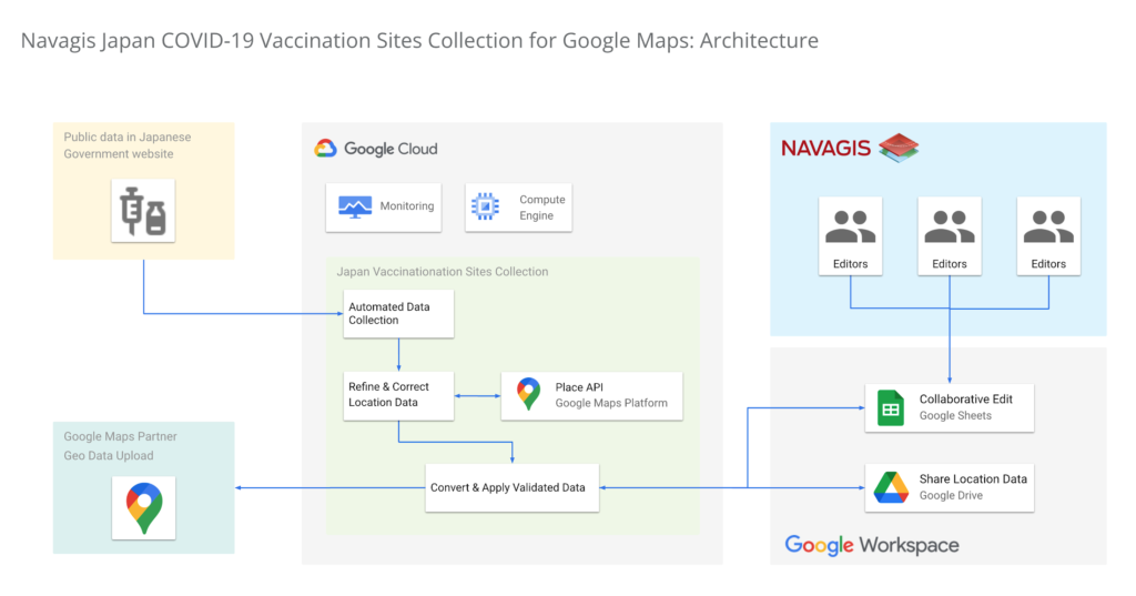
In under two weeks, we had identified, matched and marked tens of thousands of locations as vaccination centers around the country. Moreover, the power of the Geolocation API and Places API enabled us to provide richer details for many of the centers.
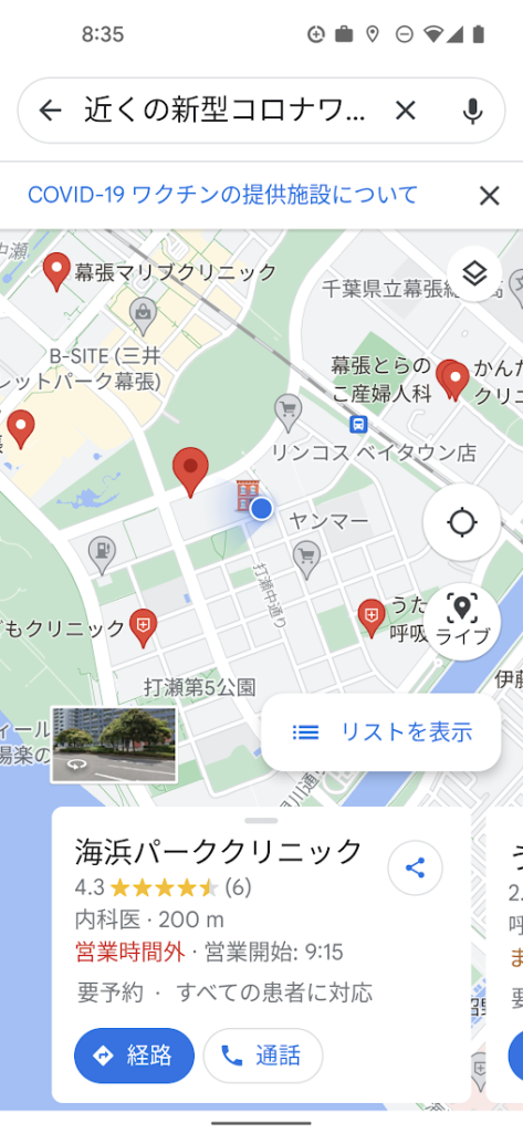
One of the unique aspects of this project was being able to surface our work across multiple channels to accomplish a single goal. We were able to work with Google to ensure the vaccine centers appeared on the consumer user-facing Google Maps apps and website, with information to help citizens learn where and how to get their vaccine. Our team was in hourly contact with requests such as “this center is mission-critical, can we get it mapped?” They were able to quickly get the site listed and visible on the map for end-users. This was a big human mobilization.
Powerful mapping APIs for pinpointed vaccine location information
We couldn’t have accomplished the massive task of validating 35,000 vaccination sites in such a short period of time without Google’s mapping APIs. The Maps Geocoding API and Places API enabled us to take location data from the government website, and quickly verify whether the location existed, or not, with up-to-date places intelligence.
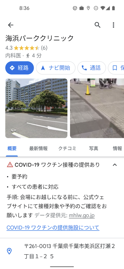
The Places API served a critical role in two ways: breadth of information (covering Japan’s entire territory), and depth of information (complex insight into each place, such as landmarks and phone numbers).
The ability to take the addresses provided by the government of vaccination sites, run them through the Places API, and assess the address quality helped enormously. Google Street View, meanwhile, provided a further level of validation, enabling us to visually identify the specific locations where errors remained, and manually identifying clinics and hospitals before identifying their precise latitude and longitude within cities in Japan.
Looking beyond COVID-19
Japan went from being a laggard in global vaccination rates before the summer of 2021 to one of the leaders, with nearly 80% of the population fully vaccinated. And, daily confirmed cases had been as low as 100 nationwide prior to Omicron emerging globally.
The prospect of putting to bed our adventure with the Japan Vaccine Locator couldn’t bring us more joy.
Except perhaps, the prospect of helping people rediscover the joy of a return to normalcy—in partnership with Google Maps Platform.
For more information on Google Maps Platform, visit our website.
Google Maps Platform Helps BungkusIT Fulfil its Promise of Deliveries in One Hour!

5532
Of your peers have already read this article.
2:00 Minutes
The most insightful time you'll spend today!
Editor’s note: Today’s post is written by Hatim M, Chief Commercial Officer at BungkusIT. The on-demand delivery service delivers packages within the hour for one million customers across Malaysia and uses Google Maps Platform to create a seamless end-to-end delivery experience for its customers.
Imagine it’s the end of a long day at work, and you’re heading home for dinner as you look forward to a restful evening. Then just as you arrive at the doorstep, your phone buzzes with a message from a family member, asking if you could grab a carton of milk from the supermarket.
With moments like these in mind, we founded BungkusIT to alleviate the stress of everyday chores and give people a break from having to run seemingly mundane errands that can often be time-consuming. With so much to do and so few hours in a day, we want to make life simpler by providing our customers with an on-demand delivery service.

As a social enterprise, our mission is to create jobs and increase earning potential for BungkusIT roadies (those who run deliveries), while also increasing online visibility for local small and medium enterprises through an e-commerce platform. As such, we don’t charge merchants a fee for being featured on our app.
Our roadies help connect users with products and services that they need. Whether it’s picking up the keys you forgot, or buying a birthday cake for a loved one, our on-demand roadies can help accomplish your task quickly and efficiently. In fact, we’ve helped many seniors—a large and often underserved population—to run errands and provide last mile support.
Providing reliable service, 24/7
From the day we launched, our promise has always been to complete every task given to us within one hour. Google Maps Platform empowers us to fulfil this promise. We understand the importance of selecting a reliable mapping service from the get-go. After exploring different map products, we made the decision to go with Google Maps Platform due to its detailed and accurate location mapping system. With the support of our partner Searce, we’ve been able to quickly integrate all the relevant products on our platform and optimize our API calls.
On a day-to-day basis, our roadies rely on the Places API to navigate their journeys. It pinpoints the exact location set by customers so that our roadies can be sure they arrive at the correct destination. With so many small roads and alleys in Malaysia, it can be challenging to find the exact place based on an address. Dropping a pin on a specific location removes any confusion.
Because we price our services based on distance, it’s business critical to determine the exact distance of a location and the most efficient route to reach it. By automating that process with the Distance Matrix API, we can guarantee that customers don’t get overcharged, while making sure that we’re adequately compensated for our services.
Improving the user experience
At the end of the day, we want to make people’s lives easier. That’s why having an app that is intuitive is key. More than that, we want customers to be able to create a request as quickly as possible. By automatically completing the location a customer is typing after they’ve keyed in the first few characters, Place Autocomplete does that job for us.

As a fairly young company, we’ve got a long way to go. I believe that we’ll continue evolving alongside Google Maps Platform and exploring the new features it has to offer. We’re already talking to global brands to expand our services and I’m confident that with Google Maps Platform as our maps partner, we will go a long way.
For more information on Google Maps Platform, visit our website.
Taking Maps Further: New Website Experience for Product Discovery, Budgeting and Access to Dev Documentation

6647
Of your peers have already read this article.
1:30 Minutes
The most insightful time you'll spend today!
For more than 15 years, developers have used Google Maps Platform to deliver location-based experiences to their end users and used location intelligence to optimize their businesses. Along this journey, we’ve made a variety of changes to better support our community as needs have changed and new industries and technologies have emerged. We started rolling out a new website experience, at https://mapsplatform.google.com, to help you better understand the products and solutions best suited to address your objectives. Plus, now you can directly connect to the developer documentation for each product to get started quickly, and you can visualize usage and associated costs to have a better idea of what to expect before getting started.
Getting to your solution faster
Maps, Routes, Places are building blocks that let you develop implementations for any use case. Building for specific use cases, however, typically requires using a combination of APIs and SDKs. To help you quickly understand what’s possible and what you need to build for your use case, you can now visit the solutions tab to select from a list of popular use cases or industries. Once you’ve selected a use case or industry, you’re taken to a page where you can explore relevant products, read helpful blog posts, see how other customers have deployed for similar use cases, and more.
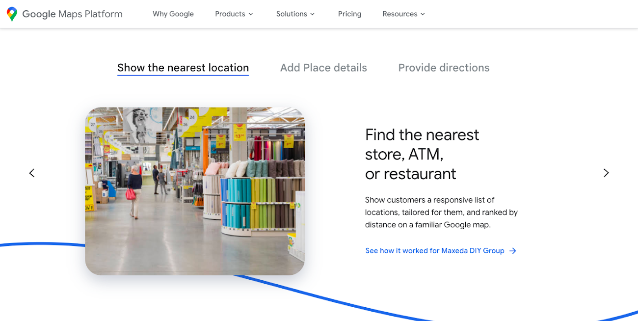
Direct access to developer documentation
Did you know there are more than a thousand pages of developer documentation created to help you get started, unblock you when you’re stuck, and share best practices? Now when you explore a product or solution from the Google Maps Platform website, you can easily navigate back and forth between our website and documentation. Just tap on JS, iOS, Android or API under the product name to get to the documentation you need.
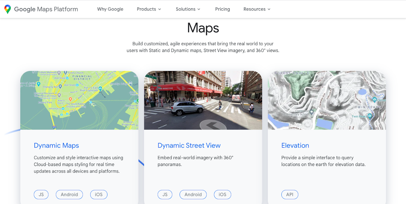
Budgeting for your project
To help you calculate pricing for your project, we’ve introduced a new pricing calculator. Once you find the product and API or SDK you plan to use, pull the slider to reflect your estimated number of monthly requests. This will automatically update the “monthly cost” column for each product and API or SDK you plan to use. If your estimated monthly requests exceed the slider limit, contact our sales team to learn about volume discounts that start at 20% off.
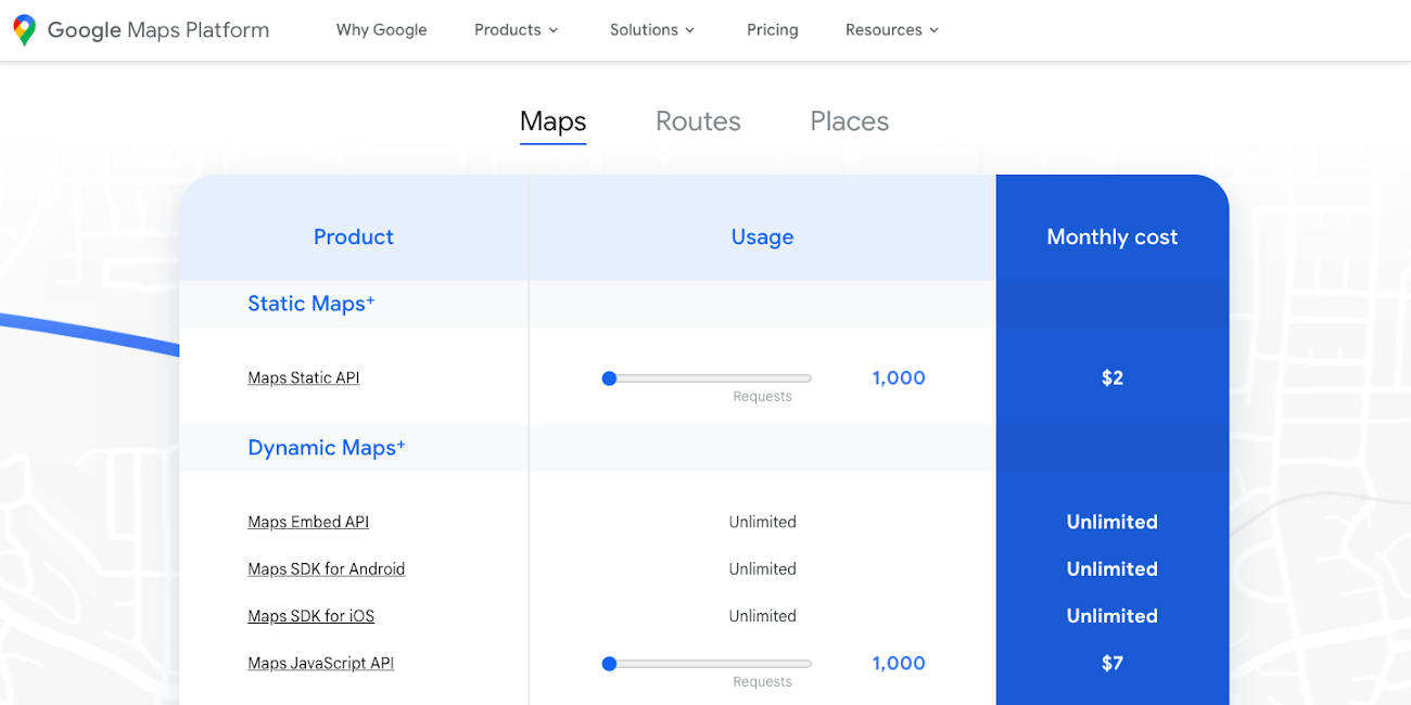
We hope our new website makes it easier to discover our products and solutions, estimate your budget, and start building with our documentation so you can deliver helpful experiences to your users and optimize your business.
For more information on Google Maps Platform, visit https://mapsplatform.google.com.
More Relevant Stories for Your Company

Scope for Tech Adoption and Advancements in Healthcare are Still High: Google Cloud Research
Since the start of the COVID-19 pandemic, there’s been a rapid acceleration of digital transformation across the entire healthcare industry. Telehealth has become a more mainstream and safe way for patients and caregivers to connect. Machine learning modeling has helped speed up innovation and drug discovery. And new levels of

Messages by Google: Unveiling New Features for AT&T Android Users
Today, we’re announcing that we’re working with AT&T to establish Messages by Google as the default messaging application for all AT&T customers in the United States using Android phones. The collaboration aims to help accelerate the industry toward global Rich Communication Services (RCS) coverage and interoperability to offer a consistent, secure, and

Bringing Multiple Security Elements Together: Chrome
Security and the way we’ve been able to advance user protections over the years is hands down one of my favorite topics when it comes to Chrome. I’ve been on the Chrome team for over 14 years and have seen the browser evolve to become a critical tool that helps


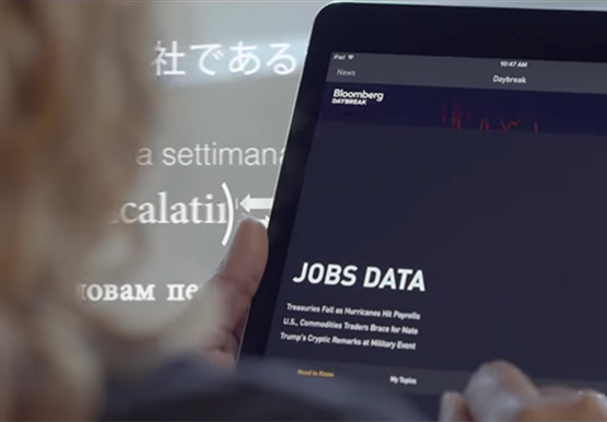

How Bloomberg uses Google Translate to Share Breaking News with the World
Bloomberg uses Google Translate to instantly share news with customers in more than 170 countries. Financial markets can move within seconds of a story breaking, so speed matters. With Google's automated translation Bloomberg can quickly disseminate breaking financial news to customers around the world in 40 different languages.
