





Lufthansa: Wind Forecasting with Google Cloud ML Helps Increase On-time Flights

2509
Of your peers have already read this article.
3:30 Minutes
The most insightful time you'll spend today!
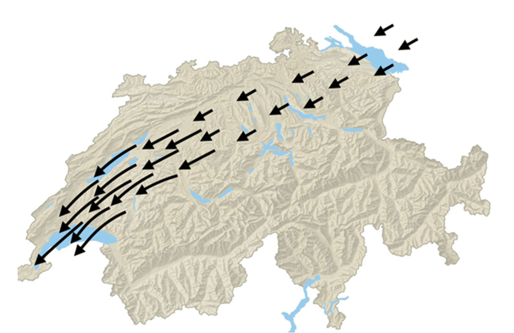
The magnitude and direction of wind significantly impacts airport operations, and Lufthansa Group Airlines are no exception. A particularly troublesome kind is called BISE: it is a cold, dry wind that blows from the northeast to southwest in Switzerland, through the Swiss Plateau. Its effects on flight schedules can be severe, such as forcing planes to change runways, which can create a chain reaction of flight delays and possible cancellations. In Zurich Airport, in particular, BISE can potentially reduce capacity by up to 30%, leading to further flight delays and cancellations, and to millions in lost revenue for Lufthansa (as well as dissatisfaction among their passengers).
Being able to predict this kind of wind well in advance lets the Network Operations Control team schedule flight operations optimally across runways and timeslots, to minimize disruptions to the schedule. However, predicting speed and magnitude can be incredibly difficult to model and thus to predict— which is why Lufthansa reached out to Google Cloud.
Machine learning (ML) can help airports and airlines to better anticipate and manage these types of disruptive weather events. In this blog post, we’ll explore an experiment Lufthansa did together with Google Cloud and its Vertex AI Forecast service, accurately predicting BISE hours in advance, with more than 40% relative improvement in accuracy over internal heuristics, all within days instead of the months it often takes to do ML projects of this magnitude and performance.
“Being impressed with Google’s technology and prowess in the field of AI and machine learning, we were certain that my working together with their expert, to combine our technology with their domain expertise, we would achieve the best results possible,“ said Christian Most, Senior Director, Digital Operations Optimization at Lufthansa Group.
Collecting and preparing the dataset
The goal of Lufthansa and Google Cloud’s project was to forecast the BISE wind for Zurich’s Kloten Airport using deep learning-based ML approaches, then to see if the prediction surpasses internal heuristics-driven solutions and gauge the ease of use and practicality of the deep learning approach in production.
Since deep learning-based techniques require large datasets, the project relies on Meteoswiss simulation data, a dataset consisting of multiple meteorological sensor measurements collected from several weather stations across Switzerland over the past five years. By using this dataset, we obtained data on factors like wind direction, speed, pressure, temperature, humidity and more, at a 10 min resolution, along with some information about the location of the weather stations, such as altitude. These factors, which we hypothesized to be predictive of the BISE, ended up carrying valuable signals, as we would see later.
This collected data was next subjected to an extensive cleaning and feature engineering process using Vertex AI Workbench, in order to prepare the final dataset for training. The cleaning phase included steps to drop the features, or rows, that contained too many missing values, or failed statistical tests for entropy, etc. Since the direction of wind is a circular feature (between 0 and 360 degrees), this column/feature was replaced with two features: the corresponding sine and cosine embedding. The dataset was then flattened such that the columns contained all the relevant features and sensor measurements from all the weather stations at a particular 10-minute interval.
Since the target variable — i.e,. BISE — was not directly available, we engineered a proxy target variable for BISE called “tailwind speed around runway,” which above a certain threshold indicates the presence of BISE along the runway.
Forecasting wind in the Cloud
Once the dataset was ready, Lufthansa and Google Cloud evaluated several options before deciding to experiment and tune Vertex AI Forecast, Google’s AutoML-powered forecasting service, in order to achieve optimum results. Vertex Forecast is capable of the required feature engineering, neural architecture search, and hyper parameter tuning, and it is managed by Google Cloud to score in the top 2.5% in the M5 Forecasting Competition on Kaggle, in a completely automated fashion. These qualities made it an excellent choice for Lufthansa, to reduce the manual overhead of creating, deploying, and maintaining top performing deep learning models.
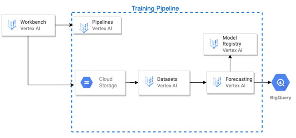
The raw data files were loaded from cloud storage, preprocessed on Vertex AI Workbench. Then, a training pipeline was initiated on Vertex AI Pipelines, which performed the following steps in sequence:
The .csv data file was loaded from Cloud Storage into a Vertex AI managed dataset.
A Vertex AI forecasting training job was initiated with the dataset, and it was also registered as a model in the Vertex AI Model Registry.
Upon completion, the model was evaluated on the test set, and the model’s predictions and the input features and ground truth of the test set, were stored in a user-defined table in BigQuery. Several test metrics were also available on the service and model dashboards.
One of the biggest challenges was the severe imbalance in the dataset, as measurements with BISE were very far and few in between. In order to account for this, instances where BISE occurred, as well the occurrences temporally close to them, were upweighted using weights calculated with methods including Inverse of Square Root of Number of Samples (ISNS), Effective Number of Samples (ENS), and Gaussian reweighting. The formulas for the methods are given below. These weights were supplied as separate columns in the dataset, and were iteratively used thereafter by the service as the “weight” column.
ISNS

ENS

Weighted gaussian

Results and next steps
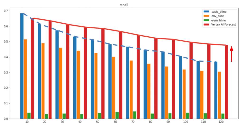
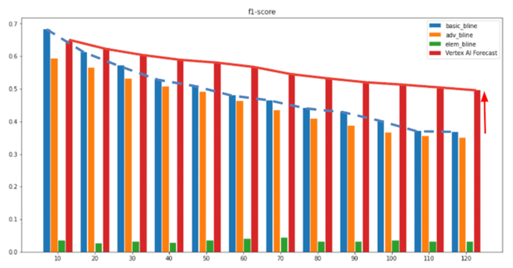
In the above figures, the x-axis represents the forecast horizon and the Y-axis shows the respective metrics (Recall/F1-score). As shown after multiple experiments, we can see Vertex AI Forecast achieved higher recall and precision t (red bar), outperforming Lufthansa’s internal baseline heuristics, with the performance gap widening steadily as the forecast horizon extends further into the future. At the two-hour mark, our custom-configured Vertex AI Forecast model improved by 40% relative to the internal heuristics and 1700% compared to the random guess baseline. As we saw with other experiments, at a six-hour forecast horizon, the performance gap widens even more, with Vertex AI Forecast in the lead. Since forecasting BISE a few hours in advance is very beneficial to prevent flight delays for Lufthansa, this was a great solution for them.
“We are very excited to be able to not only do accurate long term forecasts for the BISE, but also that Vertex AI Forecasting makes training and deploying such models much easier and faster, allowing us to innovate rapidly to serve our customers and stakeholders in the best possible manner,” said Swiss Oliver Rueegg, Product Owner, Swiss International Airlines.
Lufthansa plans to explore productionizing this solution by integrating it into their Operations Decision Support Suite, which is used by the network controllers in the Operations Control Center in Kloten, as well as to work closely with Google’s specialists to integrate both Vertex AI Forecast and other of Google’s AI/ML offerings for their use cases.
3024
Of your peers have already watched this video.
16:30 Minutes
The most insightful time you'll spend today!
Predicting Treasury Settlement Failures with ML
BNY Mellon’s Government Securities Services (GSS) business is the sole provider of treasury settlement services in the United States of America. Given its unique market position, GSS is exploring how to help clients improve their forecasting of $70+ billion in daily settlement fails leveraging Google Cloud.
Sarthak Pattanaik, Chief Information Officer, Clearance and Collateral Technology, The Bank of New York Mellon and Victor O’Laughlen, Digital Business Leader, Clearance and Collateral, The Bank of New York Mellon, share how they utilized Google Cloud AI solutions to predict treasury settlement failures.
They take us through the business process, the steps they took to set up their AI solution, and what they have learnt on their journey—not just from a technical standpoint but from a cultural one as well.
Building Unique Customer Experiences with Speed & Scale: Sprinklr & Google Cloud

8231
Of your peers have already read this article.
2:00 Minutes
The most insightful time you'll spend today!
Enterprises are increasingly seeking out technologies that help them create unique experiences for customers with speed and at scale. At the same time, customers want flexibility when deciding where to manage their enterprise data, particularly when it comes to business-critical applications.
That’s why I’m thrilled that Sprinklr, the unified customer experience management (Unified-CXM) platform for modern enterprises, has partnered with Google Cloud to accelerate its go-to-market strategy and grow awareness among our joint customers. Sprinklr will work closely with our global salesforce, benefitting from our deep relationships with enterprises that have chosen to build on Google Cloud.
Akin to Google Cloud’s mission to accelerate every organization’s ability to digitally transform their business through data-powered innovation, Sprinklr’s primary objective is to empower the world’s largest and most loved brands to make their customers happier by listening, learning, and taking action through insights. With this strategic partnership now in place, Sprinklr and Google Cloud will go-to-market together with the end-customer as our sole focus.
Traditionally, brands have adopted point solutions to manage segments of the customer journey. In isolation, these may work — but they rarely work collaboratively, even when vendors build “Frankenstacks” of disconnected products. These solutions can’t deliver a 360° view of the customer, and often reinforce departmental silos. All of which creates point-solution chaos.
Sprinklr’s approach is fundamentally different and is the way out of the aforementioned point-solution chaos. As the first platform purpose-built for unified customer experience management (Unified-CXM) and trusted by the enterprise, Sprinklr’s industry-leading AI and powerful Care, Marketing, Research, and Engagement solutions enable the world’s top brands to learn about their customers, understand the marketplace, and reach, engage, and serve customers on all channels to drive business growth.
Sprinklr was built from the ground up as a platform-first solution, designed to evolve and grow with the rapid expansion of digital channels and applications. The results? Faster innovation. Stronger performance. And a future-proof strategy for customer engagement on an enterprise scale.
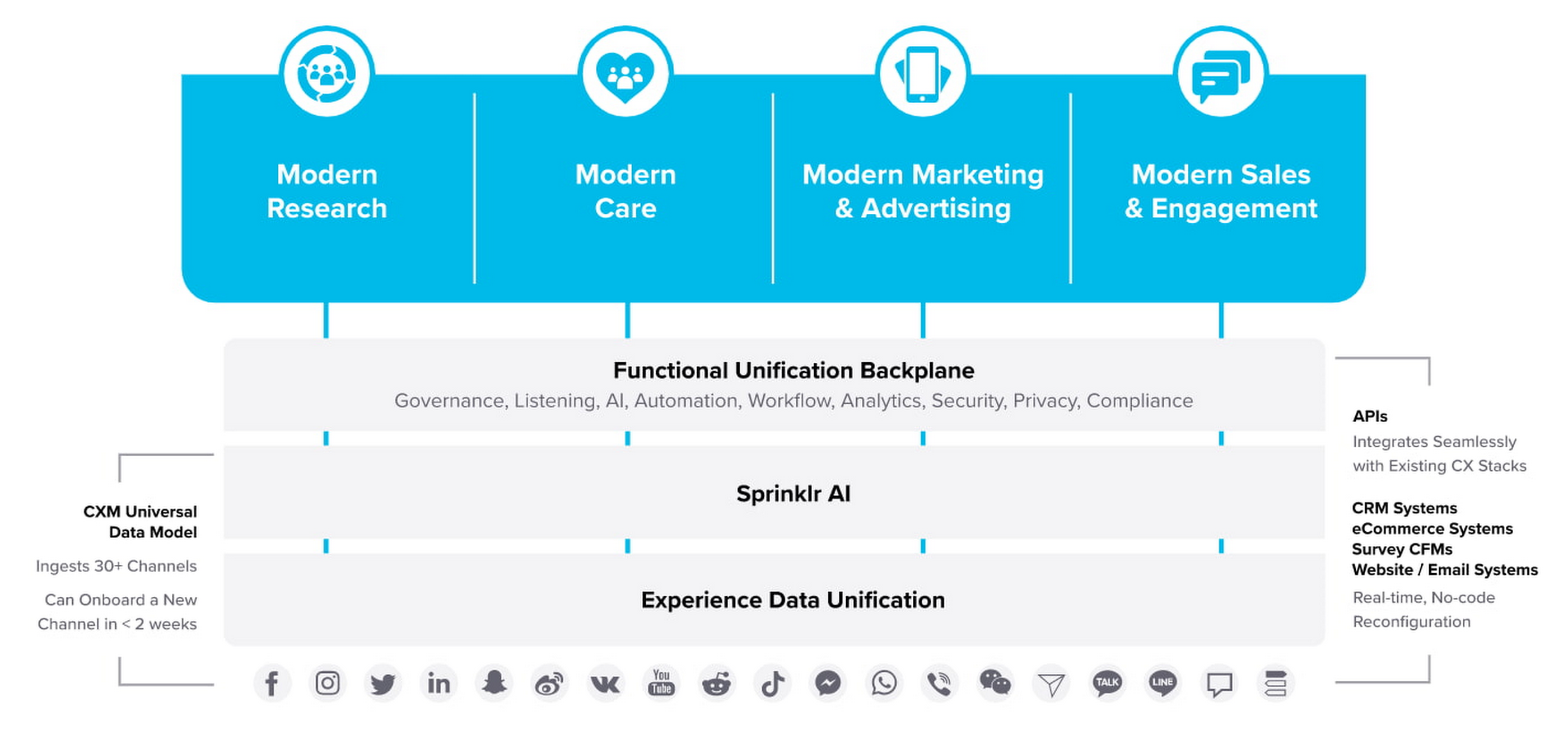
“Sprinklr works with large, global companies that want flexibility when deciding where to manage their enterprise data and consider our platform a business-critical application,” said Doug Balut, Senior Vice President of Global Alliances, Sprinklr. “Giving our customers the opportunity to manage Sprinklr on Google Cloud empowers them to create engaging customer experiences while maintaining the high security, scalability, and performance they need to run their business.”
To learn more about this exciting partnership and the challenges we jointly solve for customers, check out the recent conversation between Google Cloud’s VP of Marketing, Sarah Kennedy, and Sprinklr’s Chief Experience Officer, Grad Conn. Or read the press release on the partnership.
Make Meaningful Analysis with Geo Boundary Public Datasets on BigQuery

6355
Of your peers have already read this article.
4:00 Minutes
The most insightful time you'll spend today!
Geospatial data is a critical component for a comprehensive analytics strategy. Whether you are trying to visualize data using geospatial parameters or do deeper analysis or modeling on customer distribution or proximity, most organizations have some type of geospatial data they would like to use – whether it be customer zipcodes, store locations, or shipping addresses. However, converting geographic data into the correct format for analysis and aggregation at different levels can be difficult. In this post, we’ll walk through some examples of how you can leverage the Google Cloud platform alongside Google Cloud Public Datasets to perform robust analytics on geographic data. The full queries can be accessed from this notebook here.
Public US Geo Boundaries dataset
BigQuery hosts a slew of public datasets for you to access and integrate into your analytics. Google pays for the storage of these datasets and provides public access to the data via the bigquery-public-data project. You only pay for queries against the data. Plus, the first 1 TB per month is free! These public datasets are valuable on their own, but when joined against your own data they can unlock new analytics use cases and save the team a lot of time.
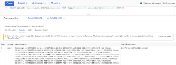
Within the Google Cloud Public Datasets Program there are several geographic datasets. Here, we’ll work with the geo_us_boundaries dataset, which contains a set of tables that have the boundaries of different geospatial areas as polygons and coordinates based on the center point (GEOGRAPHY column type in BigQuery), published by the US Census Bureau.
Mapping geospatial points to hierarchical areas
Many times you will find yourself in situations where you have a string representing an address. However, most tools require lat/long coordinates to actually plot points. Using the Google Maps Geocoding API we can convert an address into a lat/long and then store the results in the BigQuery table.
With a lat/long representation of our point, we can join our initial dataset back onto any of the tables here using the ST_WITHIN function. This allows us to check and see if a point is within the specified polygon.
ST_WITHIN(geography_1, geography_2)
This can be helpful for ensuring standard nomenclature; for example, metropolitan areas that might be named differently. The query below maps each customers’ address to a given metropolitan area name.
SELECTcust.id as customer_id,metro.name as metro_nameFROM `looker-private-demo.retail.customers` as cust,`bigquery-public-data.geo_us_boundaries.metropolitan_divisions` as metroWHERE ST_WITHIN(ST_GEOGPOINT(cust.longitude, cust.latitude),metro.metdiv_geom)
It can also be useful for converting to designated market area (DMA), which is often used in creating targeted digital marketing campaigns.
SELECTcust.id as customer_id,dma.dma_nameFROM `looker-private-demo.retail.customers` as cust,`bigquery-public-data.geo_us_boundaries.designated_market_area` as dmaWHERE ST_WITHIN(ST_GEOGPOINT(cust.longitude, cust.latitude),dma.dma_geom)
Or for filling in missing information; for example, some addresses may be missing zip code which results in incorrect calculations when aggregating up to the zipcode level. By joining onto the zip_codes table we can ensure all coordinates are mapped appropriately and aggregate up from there.
SELECTzip.zip_code,count(distinct cust.id) as unique_customersFROM `looker-private-demo.retail.customers` as cust,`bigquery-public-data.geo_us_boundaries.zip_codes` as zipWHERE ST_WITHIN(ST_GEOGPOINT(cust.longitude, cust.latitude),zip.zip_code_geom)GROUP BY 1
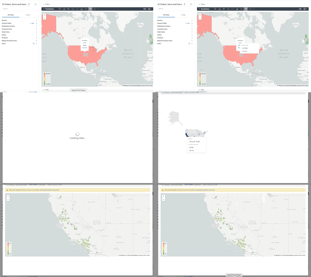
Note that the zip code table isn’t a comprehensive list of all US zip codes, they are zip code tabulation areas (ZCTAs). Details about the differences can be found here. Additionally, the zip code table gives us hierarchical information, which allows us to perform more meaningful analytics. One example is leveraging hierarchical drilling in Looker. I can aggregate my total sales up to the country level, and then drill down to state, city and zipcode to identify where sales are highest. You can also use the BigQuery GeoViz tool to visualize geospatial data!
Aside from simply checking if a point is within an area, we can also use ST_DISTANCE to do something like find the closest city using the centerpoint for the metropolitan area table.
SELECTcust.id as customer_id,ARRAY_AGG(metro.name order by ST_DISTANCE(ST_GEOGPOINT(cust.longitude, cust.latitude),metro.internal_point_geom) asc limit 1)[offset(0)] as metro_nameFROM`looker-private-demo.retail.customers` as cust,`bigquery-public-data.geo_us_boundaries.metropolitan_divisions` as metroGROUP BY cust.id
This concept doesn’t just hold true for points, we can also leverage other GIS functions to see if a geospatial area is contained within areas that are listed in the boundaries datasets. If your data comes into BigQuery as a GeoJSON string, we can convert it to a GEOGRAPHY type using the ST_GEOGFROMGEOJSON function. Once our data is in a GEOGRAPHY type we can do things like check to see what urban area the geo is within – using either ST_WITHIN or ST_INTERSECTS to account for partial coverage. Here, I am using the customer’s zip code to find all metropolitan divisions where the zip code polygon and the metropolitan polygon intersect. I am then selecting the metropolitan area that has the most overlap (or the intersection has the largest area) to be the customer’s metro that we use for reporting.
SELECTcust.id as customer_id,ARRAY_AGG(metro.name order by ST_AREA(ST_INTERSECTION(zip.zip_code_geom,metro.metdiv_geom)) desc limit 1)[offset(0)] as metro_nameFROM`looker-private-demo.retail.customers` as custJOIN `bigquery-public-data.geo_us_boundaries.zip_codes` as zip on cust.zip=zip.zip_code,`bigquery-public-data.geo_us_boundaries.metropolitan_divisions` as metroWHERE ST_INTERSECTS(zip.zip_code_geom,metro.metdiv_geom)GROUP BY cust.id
The same ideas can be applied to the other tables in the dataset including the county, urban areas and National Weather Service forecast regions (which can also be useful if you want to join your datasets onto weather data).
Correcting for data discrepancy
One problem that we may run into when working with geospatial data is that different data sources may have different representations of the same information. For example, you might have one system that records state as a two letter abbreviation and another using the full name. Here, we can use the state table to join the different datasets.
SELECTst.state_name,sum(ab.sales+fn.sales) as total_salesFROM `bigquery-public-data.geo_us_boundaries.states` as stLEFT JOIN abbreviated_table as ab on ab.state = st.stateLEFT JOIN fullname_table as fn on fn.state = st.state_nameWHERE COALESCE(ab.state, fn.state) IS NOT NULLGROUP BY 1
Another example might be using the tables as a source of truth for fuzzy matching. If the address is a manually entered field somewhere in your application, there is a good chance that things will be misspelled. Different representations of the same name may prevent tables from joining with each other or lead to duplicate entries when performing aggregations. Here, I use a simple Soundex algorithm to generate a code for each county name, using helper functions from this blog post. We can see that even though some are misspelled they have the same Soundex code.
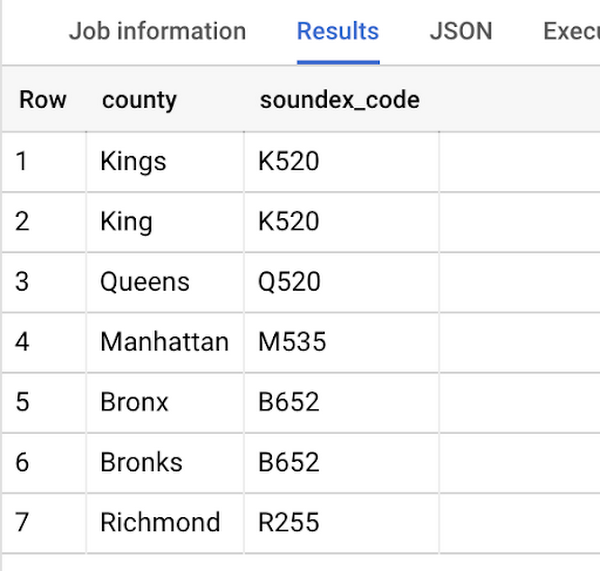
Next, we can join back onto our counties table so we make sure to use the correct spelling of the county name. Then, we can simply aggregate our data for more accurate reporting.
SELECTc.county_name,sum(sales) as total_salesFROMtableJOIN `bigquery-public-data.geo_us_boundaries.counties` as con testing.dq_fm_Soundex(table.county) = testing.dq_fm_Soundex(c.county_name)WHERE c.state_fips_code = cast(36 as string)GROUP BY 1
Note that fuzzy matching definitely isn’t perfect and you might need to try different methods or apply certain filters for it to work best depending on the specifics of your data.
The US Geo Boundary datasets allow you to perform meaningful geographic analysis without needing to worry about extracting, transforming or loading additional datasets into BigQuery. These datasets, along with all the other Google Cloud Public Datasets, will be available in the Analytics Hub. Please sign up for the Analytics Hub preview, which is scheduled to be available in the third quarter of 2021, by going to g.co/cloud/analytics-hub.
An Out-of-the-box, End-to-end Solution for Contact Centers!

3583
Of your peers have already read this article.
3:00 Minutes
The most insightful time you'll spend today!
Providing best-in-class customer service is crucial for the success of your business. Contact centers are a critical touch point, as they have to balance between representing your brand and prioritizing customer care. When your customers seek help and support, they expect efficient service that is accessible through modern voice and digital channels. In short, customer expectations are increasing—and that’s a problem if your contact center infrastructure and solutions are becoming outdated.
All of these factors are why today, we’re announcing Google Cloud Contact Center AI Platform, an expansion to Contact Center AI that offers an out-of-box, end-to-end solution for the contact center. It brings together the advantages of AI, cloud scalability, multi-experience capabilities, and tight integration with customer relationship management (CRM) platforms to unify sales, marketing, and support teams around data across the customer journey.
Improving customer experiences from all angles
Google Cloud’s Contact Center AI helps you leverage AI to scale your contact center interactions while maintaining a high level of customer satisfaction. Over the last two years, we have built a large group of partners, including the largest contact center and customer experience ISVs and our system integrator ecosystem, to bring Contact Center AI to customers. Today, we are helping enterprises across industries and geographies to cost-effectively reimagine contact center experiences. For example, Marks & Spencer reduced in-store call volume by 50%, and similarly, The Home Depot improved call containment by 185%, all while significantly increasing customer self-service engagement.
Adding to our Contact Center AI capabilities, Contact Center AI Platform is purpose-built for customer relationship management, extending your ability to offer personalized customer experiences that are consistent across your brand, whether delivered through a virtual agent, a human agent, or a combination of both. It eliminates many long-running pain points, from managing data fragmentation to replacing rigid customer experience flows with more engaging, personalized, and flexible support. With this addition, Contact Center AI now lets you:
- Orchestrate the customer journey by creating modern experiences that can be embedded in their chosen channels with mobile/web software developer kits (SDKs), compatible with iOS and Android;
- Leverage CRM as a single source of insight into the customer experience, to unify content, increase personalization, and automate processing with CRM data unification;
- Manage multiple channels without pivoting across voice, SMS, and chat support;
- Predict customer needs and route calls appropriately with AI-driven routing, based on both historical CRM data and real-time interactions;
- Automate scheduling, schedule adherence monitoring, and manage employee scheduling preferences with Workforce Optimization (WFO) integration;
- Provide customers with self-service via web or mobile interfaces using Visual Interactive Voice Response (IVR).
Helping you do more with contact centers
The addition of Contact Center AI Platform provides your partners the ability to integrate with Contact Center AI, so you can enjoy a more seamless experience operating your customer service center, with a complete view of the customer in a single workspace that includes real-time AI intelligence, native agent call controls, and real-time call transcription. For example, we are expanding our partnership with Salesforce to integrate Contact Center AI with Service Cloud Voice to deliver a unified Service Cloud agent console and Customer 360.
“Customers are continually raising their service expectations, and our research tells us 79% of consumers believe the experience a company provides is as important as its products and services,” said Ryan Nichols, SVP & GM, Contact Center, for Salesforce Service Cloud. “Through intelligence, workflows, and a deeper understanding of the customer, Salesforce’s Service Cloud Voice paired with Google’s Contact Center AI will empower agents with a seamless experience to help them wow customers.”
We are also excited to partner with UJET, an innovative and experienced Contact Center as a Service (CCaaS) provider. UJET offers secure user-centric design, scalability, and mobile-focused solution, with turnkey implementation, strong omnichannel capabilities, and best-in-class user experience, making their product a natural fit into Google’s contact center vision. To learn more about the partnership, see here.
Delivering impact for customers
Contact Center AI is already making a difference for our customers such as OneUnited Bank, the largest Black-owned bank in the U.S. “OneUnited Bank has been in partnership with Google Cloud and UJET, as well as a long-standing customer of Salesforce. The expansion and enhancements of Google Cloud’s Contact Center AI, along with its deeper integration with Salesforce, means better return on investment as we drive towards evolving our contact center to deliver exceptional client experiences,” said Teri Williams, President and Chief Operating Officer at OneUnited Bank.
Fitbit, which boasts more than 29 million active users, is also reaping the benefits. “Fitbit relies on Google Cloud and UJET to provide support to our customers with a mobile-first approach. This collaboration, in combination with a strong Salesforce integration, has helped us modernize our entire customer support experience,” stated Cassandra Johnson, VP, Devices & Services Customer Care & Vendor Management Office, at Google.
According to industry analyst Sheila McGee-Smith of McGee-Smith Analytics, “Google Cloud’s Contact Center AI is already a force in the contact center industry thanks to its early focus on AI for customer experience.” She continued, “Through their partnerships with UJET and Salesforce, as well as these expanded capabilities, Google Cloud’s Contact Center AI Platform will help define the future of customer service by powering more secure, engaging, and personalized customer experiences.”
Contact Center AI Platform is supported by a host of integration partners, including Accenture, CDW, Cognizant, Deloitte, HCL, IBM, Infosys, Quantiphi, Tata Consultancy Services, and Wipro. We will also continue to partner closely with the contact center and customer experience (CX) ISVs that our customers already rely on. If you already have a contact center solution provider, you can still integrate Google Cloud’s Contact Center AI into your existing environment.
To learn more about how you can leverage the power of AI to reimagine your contact center experience, visit our Contact Center AI page.
Leverage ML to Spot Anomalies in Real-time Forex Data

3108
Of your peers have already read this article.
6:00 Minutes
The most insightful time you'll spend today!
Let’s say you are a quantitative trader with access to real-time foreign exchange (forex) price data from your favorite market data provider. Perhaps you have a data partner subscription, or you’re using a synthetic data generator to prove value first. You know there must be thousands of other quants out there with your same goal. How will you differentiate your anomaly detector?
What if, instead of training an anomaly detector on raw forex price data, you detected anomalies in an indicator that already provides generally agreed buy and sell signals? Relative Strength Index (RSI) is one such indicator; it is often said that RSI going above 70 is a sell signal, and RSI going below 30 is a buy signal. As this is just a simplified rule, it means there could be times when the signal is inaccurate, such as a currency market correction, making it a prime opportunity for an anomaly detector.
This gives us the following high level components:

Of course, we want each of these components to handle data in real time, and scale elastically as needed. Dataflow pipelines and Pub/Sub are the perfect services for this. All we need to do is write our components on top of the Apache Beam sdk, and they’ll have the benefit of distributed, resilient and scalable compute.
Luckily for us, there are some great existing Google plugins for Apache Beam. Namely, a Dataflow time-series sample library that includes RSI calculations, and a lot of other useful time series metrics; and a connector for using AI Platform or Vertex AI inference within a Dataflow pipeline. Let’s update our diagram to match, where the solid arrows represent Pub/Sub topics.
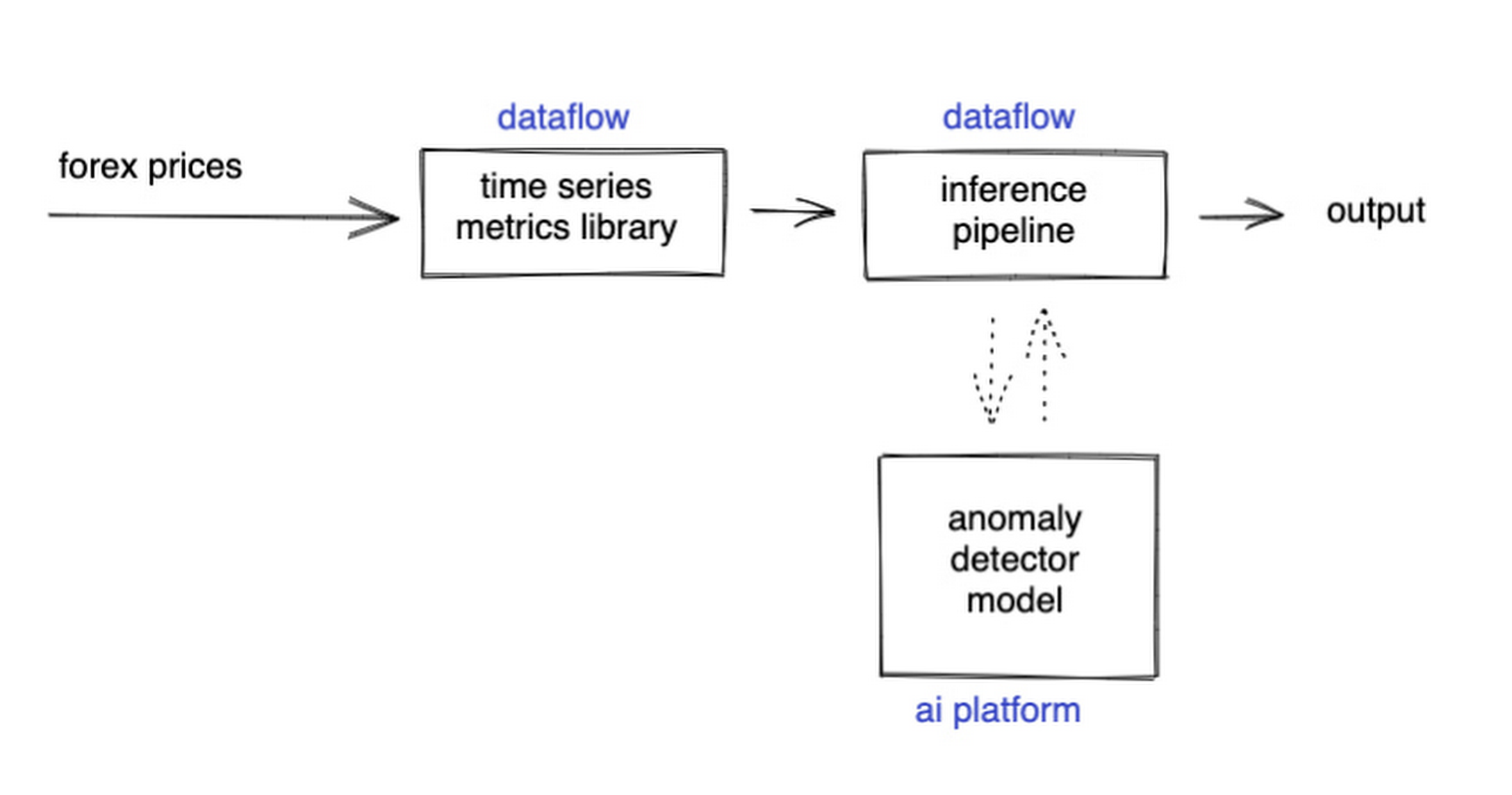
The Dataflow time-series sample library also provides us with gap-filling capabilities, which means we can rely on having contiguous data once the flow reaches our machine learning (ML) model. This lets us implement quite complex ML models, and means we have one less edge case to worry about.
So far we’ve only talked about the real time data flow, but for visualization and continuous retraining of our ML model, we’re going to want historical data as well. Let’s use BigQuery as our data warehouse, and Dataflow to plumb Pub/Sub into it. As this plumbing job is embarrassingly parallelizable, we wrote our pipeline to be generic across data types and share the same Dataflow job, such that compute resources can be shared. This results in efficiencies of scale both in cost savings and time required to scale-up.

Data Modeling
Let’s discuss data formats a bit further here. An important aspect of running any data engineering project at scale is flexibility, interoperability and ease of debugging. As such, we opted to use flat JSON structures for each of our data types, because they are human readable and ubiquitously understood by tooling. As BigQuery understands them too, it’s easy to jump into the BigQuery console and confirm each component of the project is working as expected.
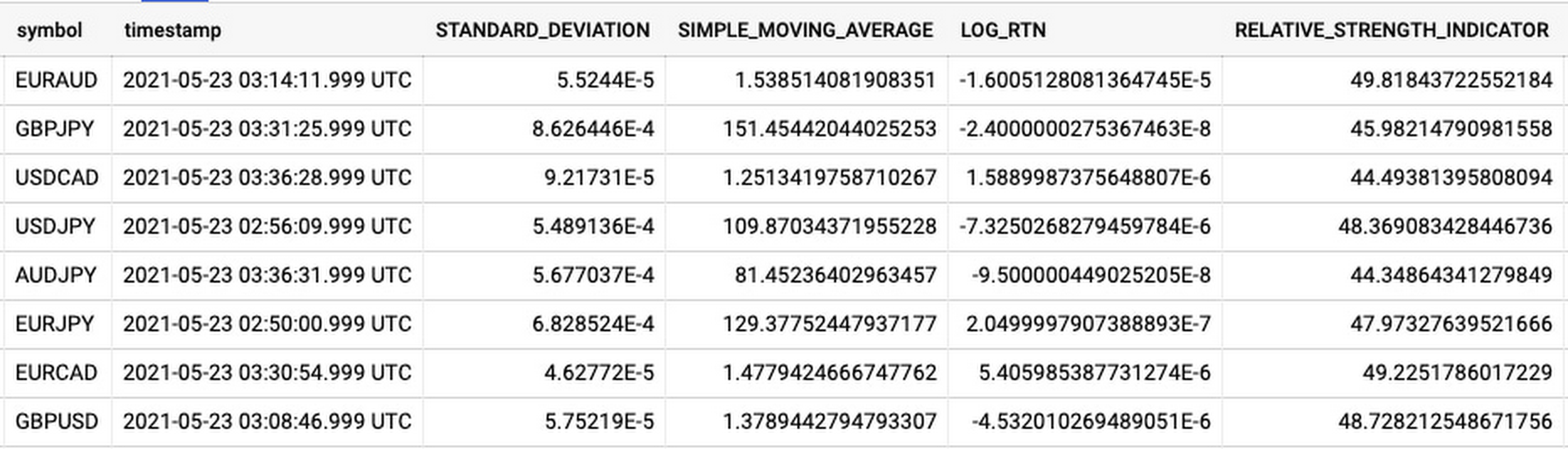
As you can see, the Dataflow sample library is able to generate many more metrics than RSI. It supports generating two types of metrics across time series windows, metrics which can be calculated on unordered windows, and metrics which require ordered windows, which the library refers to as Type 1 metrics and Type 2 metrics, respectively. Unordered metrics have a many-to-one relationship, which can help reduce the size of your data by reducing the frequency of points through time. Ordered metrics run on the outputs of the unordered metrics, and help to spread information through the time domain without loss in resolution. Be sure to check out the Dataflow sample library documentation for a comprehensive list of metrics supported out of the box.
As our output is going to be interpreted by our human quant, let’s use the unordered metrics to reduce the time resolution of our flow of real time data to one per second, or one hertz. If our output was being passed into an automated trading algorithm, we might choose a higher frequency. The decision for the size of our ordered metrics window is a little more difficult, but broadly determines the amount of time-steps our ML model will have for context, and therefore the window of time for which our anomaly detection will be relevant. We at least need it to be larger than our end-to-end latency, to ensure our quant will have time to act. Let’s set it to five minutes.
Data Visualization
Before we dive into our ML model, let’s work on visualization to give us a more intuitive feel for what’s happening with the metrics, and confirm everything we’ve got so far is working. We use the Grafana helm chart with the BigQuery plugin on a Google Kubernetes Engine (GKE) Autopilot cluster. The visualisation setup is entirely config-driven and provides out-of-the-box scaling, and GKE gives us a place to host some other components later on.
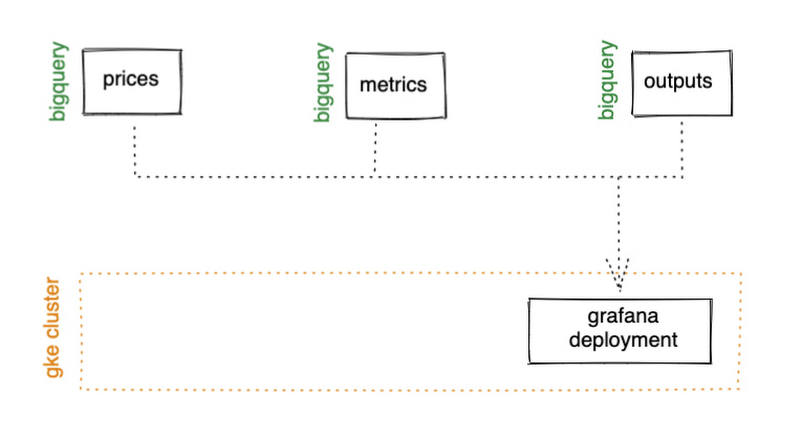
GKE Autopilot has Workload Identity enabled by default, which means we don’t need to worry about passing around secrets for BigQuery access, and can instead just create a GCP service account that has read access to BigQuery and assign it to our deployment through the linked Kubernetes service account.
That’s it! We can now create some panels in a Grafana dashboard and see the gap filling and metrics working in real time.

Building and deploying the Machine Learning Model
Ok, ML time. As we alluded to earlier, we want to continuously retrain our ML model as new data becomes available, to ensure it remains up to date with the current trend of the market. TensorFlow Extended (TFX) is a platform for creating end-to-end machine learning pipelines in production, and eases the process around building a reusable training pipeline. It also has extensions for publishing to AI Platform or Vertex AI, and it can use Dataflow runners, which makes it a good fit for our architecture. The TFX pipeline still needs an orchestrator, so we can host that in a Kubernetes job, and if we wrap it in a scheduled job, then our retraining happens on a schedule too!

TFX requires our data be in the tf.Example format. The Dataflow sample library can output tf.Examples directly, but this tightly couples our two pipelines together. If we want to be able to run multiple ML models in parallel, or train new models on existing historical data, we need our pipelines to only be loosely coupled. Another option is to use the default TFX BigQuery adaptor, but this restricts us to each row in BigQuery mapping to exactly one ML sample, meaning we can’t use recurrent networks.
As neither of the out-of-the-box solutions met our requirements, we decided to write a custom TFX component that did what we needed. Our custom TFX BigQuery adaptor enables us to keep our standard JSON data format in BigQuery and train recurrent networks, and it keeps our pipelines loosely coupled! We need the windowing logic to be the same for both training and inference time, so we built our custom TFX component using standard Beam components, such that the same code can be imported in both pipelines.
def window_elements(pipeline: beam.Pipeline,window_length: int,drop_irregular_windows: bool = True,sort_windows_by: str = "timestamp",):"""Window elements into regular windows of a given size.Assumes elements flow at a fixed rate of 1Hz."""def _sort_windows(window: Iterable[Dict[Text, Any]]) -> List[Dict[Text, Any]]:sorted_window = sorted(window, key=lambda e: e[sort_windows_by])return sorted_windowwindowed_elements = (pipeline| "AddConstantKey" >> beam.Map(lambda item: (0, item))| "WithSlidingWindow">> beam.WindowInto(beam.transforms.window.SlidingWindows(window_length, 1),trigger=beam.transforms.trigger.AfterCount(window_length),accumulation_mode=beam.transforms.trigger.AccumulationMode.DISCARDING,)| "CombineWindow" >> beam.GroupByKey()| "GetValues" >> beam.Values())if drop_irregular_windows:windowed_elements = windowed_elements | "EnforceWindowLengths" >> beam.Filter(lambda w: len(w) == window_length).with_output_types(List[Dict[Text, Any]])if sort_windows_by is not None:windowed_elements = windowed_elements | "Sort" >> beam.Map(_sort_windows).with_output_types(List[Dict[Text, Any]])return windowed_elements
With our custom generator done, we can start designing our anomaly detection model. An autoencoder utilising long-short-term-memory (LSTM) is a good fit for our time-series use case. The autoencoder will try to reconstruct the sample input data, and we can then measure how close it gets. That difference is known as the reconstruction error. If there is a large enough error, we call that sample an anomaly. To learn more about autoencoders, please consider reading chapter 14 from Deep Learning by Ian Goodfellow, Yoshua Bengio, and Aaron Courville.
Our model uses simple moving average, exponential moving average, standard deviation, and log returns as input and output features. For both the encoder and decoder subnetworks, we have 2 layers of 30 time step LSTMs, with 32 and 16 neurons, respectively.
In our training pipeline, we include z score scaling as a preprocessing transformer – which is usually a good idea when it comes to ML. However, there’s a nuance to using an autoencoder for anomaly detection. We need not only the output of the model, but also the input, in order to calculate the reconstruction error. We’re able to do this by using model serving functions to ensure our model returns both the output and preprocessed input as part of its response. As TFX has out-of-the-box support for pushing trained models to AI Platform, all we need to do is configure the pusher, and our (re)training component is complete.
Detecting Anomalies in real time
Now that we have our model in Google Cloud AI Platform, we need our inference pipeline to call to it in real time. As our data is using standard JSON, we can easily apply our RSI rule of thumb inline, ensuring our model only runs when needed. Using the reconstructed output from AI Platform, we are then able to calculate the reconstruction error. We choose to stream this directly into Pub/Sub to enable us to dynamically apply an anomaly threshold when visualising, but if you had a static threshold you could apply it here too.
with beam.Pipeline(options=pipeline_options) as pipeline:(pipeline| "ReadFromPubSub">> beam.io.ReadFromPubSub(topic=input_metrics,timestamp_attribute=timestamp_key,)| "DeserialiseJSON" >> beam.Map(pubsub_serialiser.to_json)| "FilterSymbol" >> beam.Filter(lambda m: m["symbol"] == symbol)| "FilterRSIThreshold">> beam.Filter(lambda m: m["RELATIVE_STRENGTH_INDICATOR"] > rsi_upper_thresholdor m["RELATIVE_STRENGTH_INDICATOR"] < rsi_lower_threshold)| "WindowElements" >> window_elements(window_length)| "RunAutoencoder">> run_windowed_inference(gcp_project_id,model_name,window_length,{f: "FLOAT" for f in feature_metrics},)| "CalcReconError" >> beam.Map(calc_reconstruction_err)| "ToJSON">> beam.Map(lambda re: {"symbol": symbol, "reconstruction_error": re})| "SerialiseJSON" >> beam.Map(pubsub_serialiser.from_json)| "WriteToPubSub">> beam.io.WriteToPubSub(topic=output_alerts,timestamp_attribute=timestamp_key,))
Summary
Here’s what the wider architecture looks like now:

More importantly though, does it fit for our use case? We can plot the reconstruction error of our anomaly detector against the standard RSI buy/sell signal, and see when our model is telling us that perhaps we shouldn’t blindly trust our rule of thumb. Go get ‘em, quant!
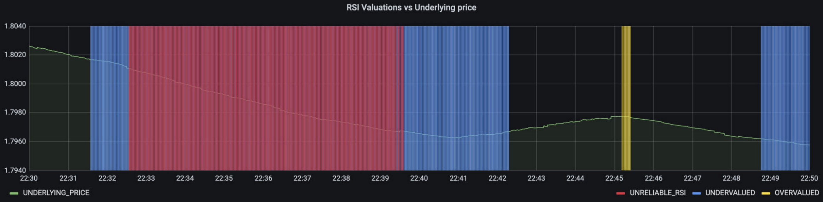
In terms of next steps, there are many things you could do to extend or adapt what we’ve covered. You might want to explore with multi-currency models, where you could detect when the price action of correlated currencies is unexpected, or you could connect all of the Pub/Sub topics to a visualization tool to provide a real-time dashboard.
Give it a try
To finish it all off, and to enable you to clone the repo and set everything up in your own environment, we include a data synthesizer to generate forex data without needing access to a real exchange. As you might have guessed, we host this on our GKE cluster as well. There are a lot of other moving parts – TFX uses a SQL database and all of the application code is packaged into a docker image and deployed along with the infra using Terraform and cloud build. But if you’re interested in those nitty gritty details, head over to the repo and get cloning!
Feel free to reach out to our teams at Google Cloud and Kasna for help in making this pattern work best for your company.
More Relevant Stories for Your Company

Simplify Cloud Development with Duet AI on Google Cloud
Cloud developers — you’ve got it all. You can code in your choice of languages, enjoy portability with containers, minimize complexity with serverless, and manage the entire software lifecycle by following DevOps principles. But let’s face it, building and onboarding new cloud applications still requires a lot of manual planning,

Google Unveils New Cloud Region in Delhi NCR to Power India’s Digitization
In the past year, Google has worked to surface timely and reliable health information, amplify public health campaigns, and help nonprofits get urgent support to Indians in need. Now, we are continuing to focus on helping India’s businesses accelerate their digital transformation, deepening our commitment to India’s digitization and economic recovery.


Driving Business Transformation in Manufacturing, Industrial, and Transportation Using Google Cloud and AI/ML
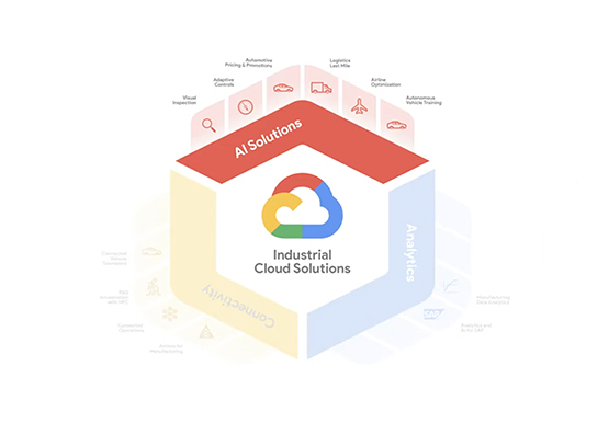
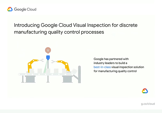
Google Cloud partners closely with manufacturing, industrial, and transportation organizations to drive business transformation. In this video, Mandeep Waraich, Head of Product - Industrial AI, Google Cloud, shares customer stories as well as Google Cloud’s differentiated AI products and solutions. Waraich covers the current state of automation and industrial efficiency

Chronicle Security Analytics: Key to Address Security Data Overload
Google Cloud's Chronicle is a security analytics platform built for modern use cases to combat modern threats. In today's world, enterprises have undergone significant changes in all aspects, and must adapt to their security needs to counter threats and attacks. Watch the video to learn Google Cloud's initiative to help
