





4688
Of your peers have already watched this video.
2:04 Minutes
The most insightful time you'll spend today!
Video: How Google App Maker Helps Businesses Build Mobile Apps in No Time
Analysts estimate that the right custom mobile app can save each employee 7.5 hours per week (that’s a week’s worth of lunch breaks!). Yet, too few businesses have the means, let alone the resources, to invest time and effort in building customized mobile apps. Why?
That’s because their budgets center on big enterprise apps like CRM, ERP, and SCM and beyond those priorities.
App Maker was created to enable your line-of-business teams to build apps for the jobs these bigger apps don’t tackle. With App Maker, you can revamp company processes like requesting purchase orders or filing and resolving help desk tickets, create quick marketing assets, and generate sales enablement apps, for example, as if you designed and built the processes yourself.
This low-code, simple, easy-to-use, drag and drop mobile app creator doesn’t need extensive coding knowledge and can build apps in a jiffy. Anyone can make it: As simple as that.
The Future of Cloud Computing: Choose Your Own Services and Payment Options

2110
Of your peers have already read this article.
1:30 Minutes
The most insightful time you'll spend today!
As the saying goes, “it’s hard to make predictions, especially about the future.” Some organizations find it challenging to predict what cloud resources they’ll need in months or years ahead. Every organization is on its own unique cloud journey. To help, we’re developing new ways for customers to consume and pay for Google Cloud services. We’re doing this by removing barriers to entry, aligning cost to consumption and providing contractual and product flexibility. Read on to learn how we’re rolling out several new go-to-market programs across these key areas to help our customers purchase and consume Google Cloud services more easily.
Removing barriers to entry with Google Cloud Flex Agreements
Many customers choose multi-year commitments because they provide better line-of-sight into IT spend and budgeting. However, these commitments can create difficulty for those who don’t have clear visibility into their future cloud consumption needs. That’s why today we’re launching Flex Agreements, which enable customers to migrate their workloads to the cloud with no up-front commitments. As part of this new licensing option, Google Cloud customers still get access to unique incentives, such as monthly spend discounts1, committed use discounts, cloud credits, and access to professional services, based on monthly spend and workloads migrated to Google Cloud.
Flex Agreements are just one example of how we are removing barriers to help customers start using Google Cloud. In 2022, we launched the Innovators Plus annual subscription, which gives developers a curated toolkit to accelerate their expertise, including access to live and on-demand training through Google Cloud Skills Boost, Google Cloud credits, and more.
We also recently expanded trials for Google Cloud products. For example, the new Spanner free trial instance is good for 90 days, allowing developers to create Google Standard SQL or PostgreSQL databases, explore Spanner capabilities, and prototype applications—with no commitment or contract needed.
Contractual and feature flexibility
Contractual flexibility has always been one of our core principles. Committed Use Discounts (CUDs), for example, provide discounted prices in exchange for a commitment to use a minimum level of resources for a specified term. Last year, we introduced Flexible CUD, spend-based commitments that offer predictable and simple flat-rate discounts that apply across multiple virtual machine families and regions.
In addition to contractual flexibility, our customers also need the flexibility to choose features and functionality based on their stages of cloud adoption and the complexity of their business requirements. Therefore, over the next few quarters, we will launch new product pricing editions—Standard, Enterprise, and Enterprise Plus—in parts of our cloud portfolio. This new commercial packaging model will help give customers more choice and flexibility to optimize their cloud spend.
For customers running workloads such as those in regulated industries like banking and public sector, the higher-end Enterprise Plus tier will offer compute, storage, networking and analytics services with high availability, multi-region support, regional failover and disaster recovery, advanced security, and a broad range of regulatory compliance support. The Enterprise pricing tier will include a broad range of features designed for customers with workloads that demand a high level of scalability, flexibility, and reliability. The Standard pricing tier will offer cost-efficient and easy-to-use managed services that include all essential capabilities such as autoscaling to meet the core workload requirements of customers.
Align costs to consumption with autoscaling
At Google Cloud, a core requirement for the products we build is providing customers industry-leading capabilities to automatically scale (autoscale) services up and down to match capacity with real-time demand. Autoscaling improves uptime, reduces infrastructure costs, and removes the operational burden of managing resources.
Many Google Cloud products include autoscaling capabilities to help customers manage unplanned variations in demand. For example, Dataflow vertical and horizontal autoscaling, in combination with granular adaptive resource configuration (aka “right-fitting”), has resulted in up to 50% saving in infrastructure costs for streaming by automatically choosing the right number of instances required to run the jobs and dynamically re-allocating more or fewer instances during the runtime of jobs. Bigtable also provides native autoscaling capabilities, and Spanner’s autoscale is an open source tool that works across regional and multi-regional Spanner deployments.
Similarly, we added multiple features such as Cluster Autoscaler, Horizontal Pod Autoscaling, Vertical Pod Autoscaling, and Node Auto-Provisioning to GKE for elasticity and cost efficiency.
For L.L.Bean, the ability to quickly scale capacity to meet changing usage patterns (e.g., during the holidays), as well as to rapidly perform load tests to test capacity, are “night and day” with Google Cloud compared to L.L.Bean’s legacy on-premises IT system.
“We won’t have to pay for peak capacity to have it available during peak shopping times. We just scale capacity up or down as needed.” — Randy Dyer, Enterprise Architect, L.L.Bean
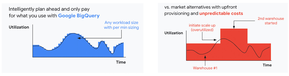
We are now taking these capabilities to the next level by enabling autoscaling in BigQuery at a more granular level so you never pay more than what you use. This allows you to provision additional capacity in smaller increments, so you never overprovision and overpay for underutilized capacity. BigQuery customers can now try the new BigQuery autoscaler (currently in public preview) in their Google Cloud console.
A commitment to flexibility and choice
At Google Cloud, we remain deeply committed to the success of our customers and partners, and we are uniquely positioned to help organizations transform their business. By providing you with more flexibility and choice in how to purchase our products, we are empowering you to be more efficient and resilient.
Join Google Data Cloud & AI Summit to hear the latest announcements around innovations in Google Data Cloud for databases, data analytics, business intelligence, and AI. Gain expert insights, new solutions, and strategies that can help you transform customer experiences with modern apps, boost revenue, and reduce costs.
1. Not available for customers buying through Partner Advantage.
5020
Of your peers have already watched this video.
2:08 Minutes
The most insightful time you'll spend today!
Tech Helps This In-Home Healthcare Service Focus on Making Lives Better and Save Costs by 23%
Buurtzorg is an in-home healthcare organization based in the Netherlands, with more than 15,000 nurses working in small community teams across Europe.
Working in small teams of empowered, highly qualified professionals, Buurtzorg provides nurse-led community care across the Netherlands. But as the number of clients grew, it was getting difficult for nurses to keep up with bureaucratic work and take care of patients at the same time. Buurtzorg’s rapid success lies in its nurses’ abilities to act quickly and effectively without unnecessary bureaucracy.
“I said why are we doing it this way? We called our company Buurtzorg, and Buurt means neighborhood. That’s why we moved to G Suite: to reduce unnecessary administrative tasks and focus on patient care,” says Jos De Blok, CEO, Buurtzorg.
Watch this 2-minute video to find out how Buurtzorg serves the community and reduces costs by 23% at the same time.
How Arvind Fashions Ltd leads the fashion industry with powerful data analytics on BigQuery

4125
Of your peers have already read this article.
3:30 Minutes
The most insightful time you'll spend today!
Arvind Ltd has been in the apparel industry for more than 90 years, with its retail powerhouse Arvind Fashions Ltd being the backbone of well-known names in the retail fashion industry in India.
Arvind Fashions Ltd (Arvind) has seen significant growth in its portfolio with new franchises being added every year. The six high conviction brands include Tommy Hilfiger, Calvin Klein, Sephora, Arrow, U.S. Polo Assn. & Flying Machine.
To secure a foundation for future growth, the company has embarked on a digital transformation (DX) journey, focusing on profitability and improving the customer experience. The key objectives for Arvind’s DX is to unlock the value of existing applications, gain new insights, and build a solid workflow with resilient systems.
Getting Google Cloud to address the challenges around insights & analytics was a natural step forward, since Arvind had already formed a relationship with Google Cloud, starting with its productivity and collaboration tools during the pandemic.
Key Challenges
Arvind’s enterprise applications estate is a mix of SAP, Oracle POS, logistics management systems and other applications. Having so many different applications made it a challenge for the company to bring all of this data together to drive retail insights and at the same time maintain the freshness of its products.
As a case in point, the existing sales reporting and inventory reconciliation process had been enabled by a mix of automated and semi-automated desktop applications. There were challenges to scale the infrastructure in order to process large amounts of data at a low latency.
The synchronization of master data across functions was critical to build the data platform that provides consistent insights to multiple stakeholders across the organization.
Solution Approach – Modern Data Platform
There are several ways to solve the challenges above and do more by building a modern data analytics platform. For example, using a data lake based approach that builds use case by use case, hybrid data estates and so on. Regardless of the approach, it is important to define the solution based on certain principles.
In Arvind’s scenario, the key business principles considered are that data platforms should support Variety, Variability, Velocity and Volume. Each of these 4 V’s are critical business pivots to successful fashion retailing. Variety in SKU’s to deal with myriad fashion trends every season, Variability in shopping footfalls due to different festivities, weekends and special occasions, Velocity to be agile and responsive to customer needs, and Volumes of data that bring richer insights.
This is where Google BigQuery enabled data platform comes in, as it is able to meet the needs above.
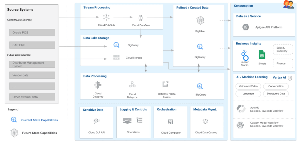
Solution Architecture – Current Capabilities & Future Vision
BigQuery is the mothership of the data and analytics platform on Google Cloud. Its serverless construct ensures that data engineering teams focus only on insights & analytics. Storage and compute is decoupled and can be independently scaled. BigQuery has been leveraged to service both the raw as well as the curated data zones.
With BigQuery procedures, it is possible to process the data natively within the data warehouse itself. Procedures have been leveraged to process the data in a low latency manner with the familiar SQL.
But then what happens to advanced analytics and insights? With simplicity being our key guiding principle, BigQuery machine learning ensures that data analysts can create, train and deploy analytics models even with complex requirements. It can also consume data from Looker Studio, which is seamlessly integrated with BigQuery.
Here are the key principles and highlights of the data platform that have been achieved:
- Simple, yet exhaustive – We needed a solution with vast technical capabilities such as data lake & data warehouse, data processing, data consumption, analytics amongst others. And at the same time it needed to be simple to implement and run ongoing operations.
- Agility – High quality analytics use cases typically require a significant amount of time, effort and skill set. While building a simple solution we ensured that the selection of technology services ensured agility in the long term.
- Security – An organization can be truly successful if the insights and analytics operations are democratized. But while data is made available to a wider community, we need to ensure data governance and security.
- Ease of operations – Data engineering teams spend a lot of time doing infrastructure setting and management operations. With BigQuery, teams can put in more effort on building the data pipelines and models to feed into analytics instead of worrying about the infrastructure operations.
- Costs – Decoupling storage and compute allows for flexible pricing. A pay-as-you-go model is the ideal solution to managing costs.
Business Impact
The ingestion frequency of the store level inventory (~800 stores) has now been changed to daily. With the additional data volumes and processing the scaling on BigQuery has been seamless. There are new processes and dashboards to address the reconciliation and root cause analysis. Operational efficiencies have improved leading to better productivity and turn around time of critical processes.
The discrepancies in various reconciliation activities have drastically reduced by an order of magnitude of 300X due to the capabilities offered by the data platform. Not only is it possible to identify discrepancies but the data platform has also enabled in identifying the root causes for the same as well.
Arvind Fashions Ltd have also been able to enhance some of the existing business processes and systems with insight from the data platform.
It’s going to be an exciting journey for Arvind Fashions Ltd and Google Cloud. There are several initiatives ready for kick off such as getting more apps on the edge devices, warehouse analytics, advanced customer data platforms, predicting the lifecycle of designs, style codes and other exciting initiatives.
CARTO’s Data Visualization Powered by Google Cloud and deck.g

4093
Of your peers have already read this article.
7:00 Minutes
The most insightful time you'll spend today!
Editor’s note: Today’s blog post is from Alberto Asuero, CTO of CARTO, the location intelligence platform. Today he shares more details about the source of the data for advanced data visualizations created with Google Maps Platform and deck.gl and how the CARTO platform enables this workflow.
During Google Cloud Next in October, the Google team announced the newest release of the deck.gl visualization library, thanks to a collaboration with our geospatial company CARTO and the vis.gl Technical Steering Committee (TSC). The deck.gl release includes a deep integration with the new WebGL-powered features in the Maps JavaScript API that allows deck.gl to render 2D and 3D visualizations directly on the Google basemap.
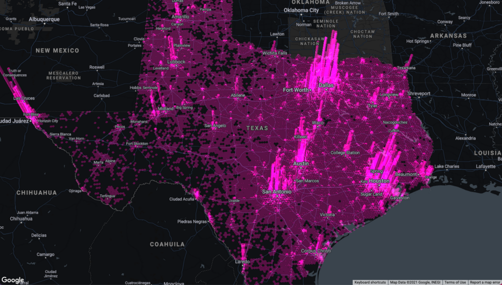
Our team built an example app that visualizes a variety of data sources that show the potential for electrification of truck fleets in Texas. This app showcases the different types of advanced data visualizations that can be created with Google Maps Platform and deck.gl. Today, I want to share more details about the source of the data for these visualizations and how the CARTO platform enables this workflow.
Google Cloud provides a strong serverless data warehousing solution, BigQuery, with support for geospatial queries. When you are dealing with spatial data, creating maps to explore and visualize these datasets is an important and common need. The CARTO Spatial Extension for BigQuery provides an easy way to create connections to the data warehouse, design a map with data coming from BigQuery tables, and then add these visualizations to a web app using deck.gl.
Making a simple map
To create a simple map using the CARTO platform, you can sign up for a trial account. Once you have signed in, you can set up a connection to your BigQuery instance using a service account. Then, you can go to the Data Explorer and browse the available datasets to find the table you want to use as the datasource in your map. For more information, check out the CARTO documentation.
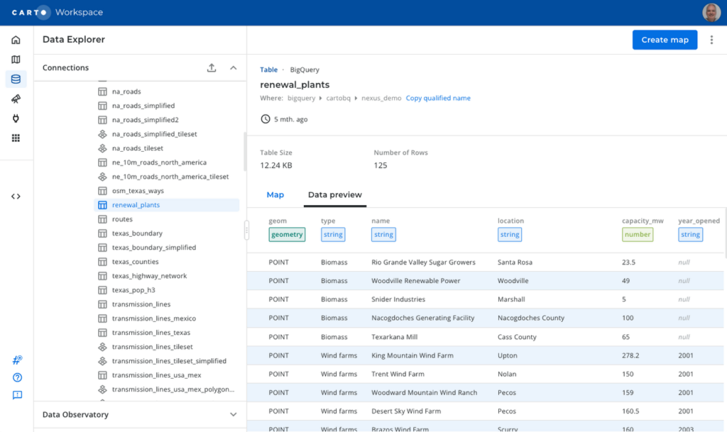
To create a visualization of power transmission lines in Texas, you can start with the Texas state boundary to provide some context. In the Data Explorer, you can preview the table and click the “Create map” button in the top-right corner to start designing your visualization.
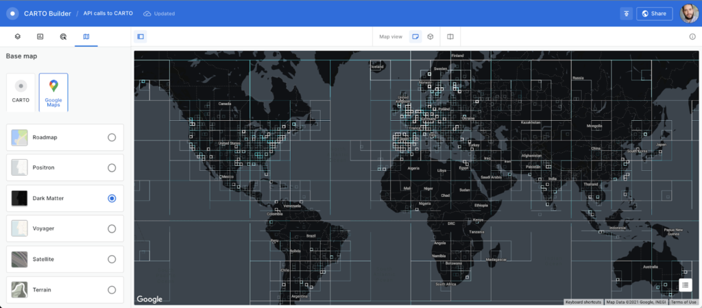
Using the CARTO Builder map making tool, select one of the available Google vector basemap styles and customize the layer style.
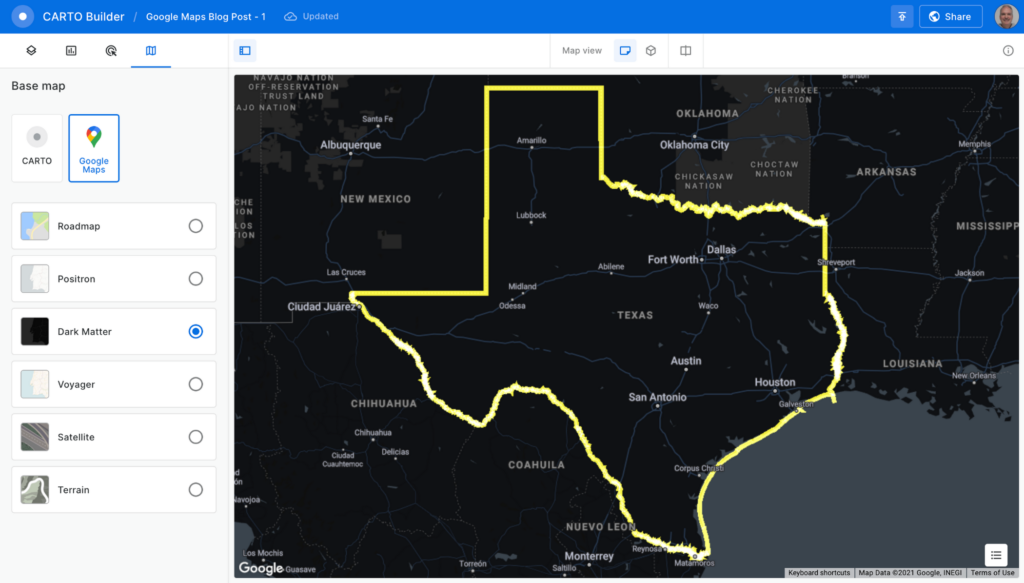
You can visualize tables and the results from queries executed in the data warehouse, which is a powerful feature because you can also execute spatial analysis functions using SQL, including those from the CARTO Analytics Toolbox. In this case, you can intersect the lines in the table containing all the U.S. transmission lines within the Texas boundary. Click on the “Add source from…” button and select the “Custom Query (SQL)” option to add the following query:
SELECT *FROM cartobq.nexus_demo.transmission_linesWHERE ST_INTERSECTS(geometry,(SELECT geom FROM cartobq.nexus_demo.texas_boundary_simplified));
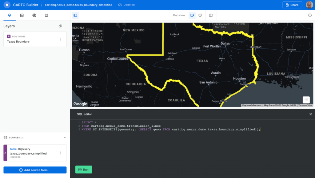
Click the “Run” button, and the query is executed in BigQuery. The results are sent back to the Builder tool. Perform some style customizations in the new layer, and your map is ready.
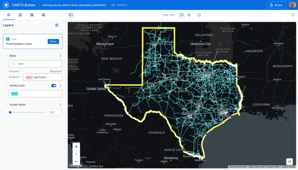
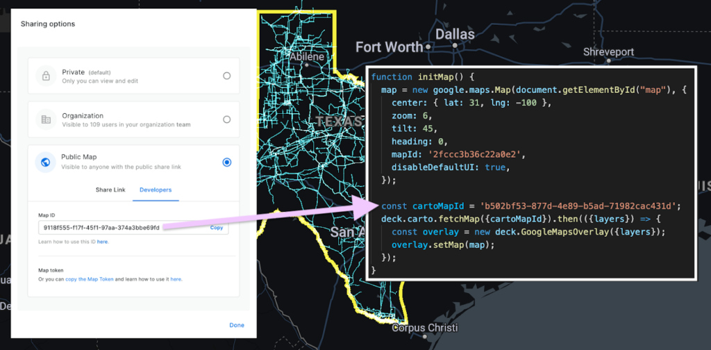
Before adding the map to the Google Maps Platform application, you’ll need to make it public. Click on the “Share” button and select the “Developers” tab to copy the map ID.
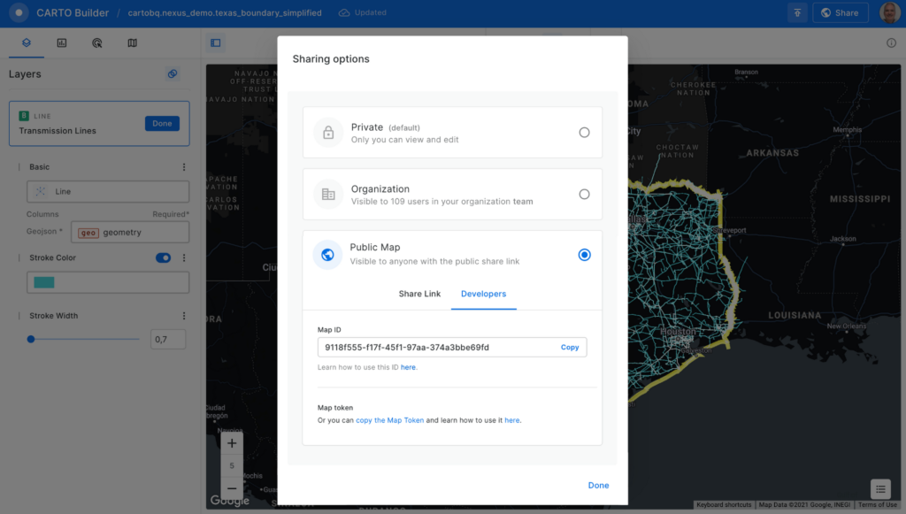
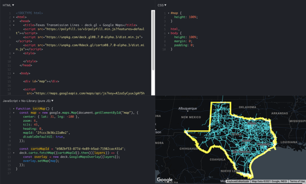
Now, you can add the visualization into your Google Maps Platform application, which is as easy as adding these four lines of code:
const cartoMapId = 'b502bf53-877d-4e89-b5ad-71982cac431d'; deck.carto.fetchMap({cartoMapId}).then(({layers}) => { const overlay = new deck.GoogleMapsOverlay({layers}); overlay.setMap(map); });
You can use the map ID copied from CARTO Builder to call the fetchMap function. This function connects to the platform and retrieves all the information needed for the visualization, including a collection of deck.gl layers with all the styling properties you’ve specified. Create an instance of the deck.gl GoogleMapsOverlay with this collection of layers and add it to the map.
You can see the full example in this fiddle.
Visualizing very large datasets
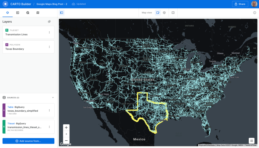
One of the main features of BigQuery is the ability to scale processing to massive datasets. With the CARTO platform, you can also visualize very large datasets using tilesets, an optimized data structure containing pre-generated vector tiles for fast visualization. Tilesets are generated within BigQuery using the Analytics Toolbox functions in a parallelized process that can handle billions of points.
For example, you can create a visualization using tilesets with the whole dataset of transmission lines for the U.S., more than 100MB of geometries.
The issue with these large datasets is that they do not fit in memory all at once, so you need to split them into tiles for them to be rendered progressively. CARTO takes care of this, allowing you to create tilesets directly in BigQuery or dynamically generate them on the fly.
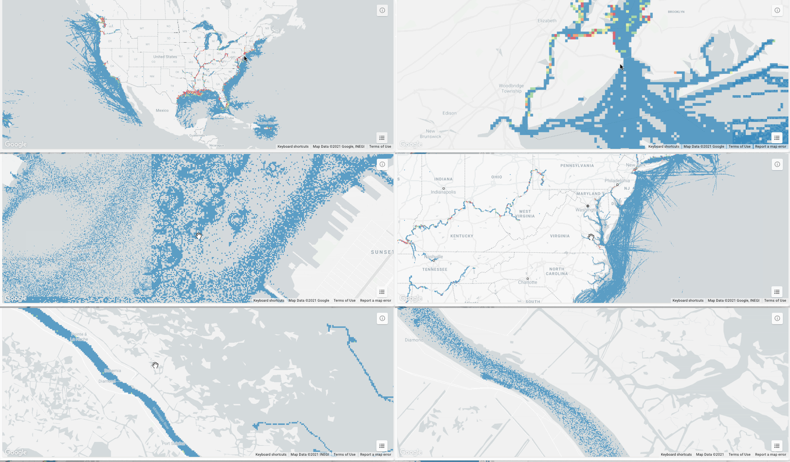
This method for data loading in maps can scale as much as needed; for example, take a look at this 17 billion point visualization of vessel data.
What about live data?
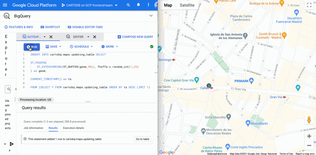
BigQuery supports streaming data that is continuously updated. In these scenarios, you want to be able to update your visualization at regular intervals, as the data changes. It’s easy to update this visualization using deck.gl. You just need to set the autoRefresh parameter to true when fetching the map and specify the function you want to execute when new data is downloaded:
const {layers} = await deck.carto.fetchMap({ cartoMapId, autoRefresh: true, onNewData: (parsedMap) => { … } });
You can add points to a table with an INSERT function on the BigQuery console and see the data updated on the map in real time.
Going further
In addition to the simple ways to create visualizations shown above, deck.gl has the flexibility to create a wide variety of visualizations. The CARTO platform provides you with the functionality to access data from your data warehouse and create these data visualizations with advanced cartographic capabilities, but you can extend it and go beyond that using any of the advanced visualizations available in the deck.gl layer catalog.
There are two additional options that give you more control over the deck.gl code. The first one is to use the CartoLayer directly without fetchMap. You’ll need to indicate the connection to use from the CARTO platform and the data source type and name or query. Then we can specify the styling properties.
const overlay = new deck.GoogleMapsOverlay({layers: [new deck.carto.CartoLayer({connection: 'bqconn',type: deck.carto.MAP_TYPES.TABLE,data: `cartobq.public_account.retail_stores`,getFillColor: [238, 77, 90],pointRadiusMinPixels: 6,}),],});
The second option is to use the fetchLayerData function that allows you to have more control over the format used for data transfer between BigQuery and your application and can be used with advanced visualizations that require an specific data format like ArcLayer, H3HexagonLayer or TripsLayer.
deck.carto.fetchLayerData({type: deck.carto.MAP_TYPES.TABLE,source: `cartobq.geo_for_good_meetup.texas_pop_h3`,connection: 'bqconn',format: deck.carto.FORMATS.JSON,credentials: {accessToken: 'eyJhbGciOiJIUzI1NiJ9.eyJhIjoiYWNfbHFlM3p3Z3UiLCJqdGkiOiI1YjI0OWE2ZCJ9.Y7zB30NJFzq5fPv8W5nkoH5lPXFWQP0uywDtqUg8y8c'}}).then(({data}) => {const layers= [new deck.H3HexagonLayer({id: 'h3-hexagon-layer',data,extruded: true,getHexagon: d => d.h3,getFillColor: [182, 0, 119, 150],getElevation: d => d.pop,elevationScale: 2.5,parameters: {blendFunc: [luma.GL.SRC_ALPHA, luma.GL.DST_ALPHA],blendEquation: luma.GL.FUNC_ADD}})];const overlay = new deck.GoogleMapsOverlay({layers});overlay.setMap(map);});
For complete code using both options, take a look at these examples.
Learn more
You can access demos and documentation on the deck.gl docs website and the CARTO Documentation Center. If you have questions, you can ping the CARTO team on the CARTO Users Slack workspace.
For more information on Google Maps Platform, visit the Google Maps Platform website.
3858
Of your peers have already watched this video.
1:06 Minutes
The most insightful time you'll spend today!
PwC uses Connected Sheets to scale data insights
It’s important for teams across the business to understand customer adoption of products and services, whether it’s the product team tracking usage of a newly released feature or the support team trying to anticipate incoming service requests. Similarly, IT teams need to analyze the adoption of an organization’s internal applications and systems, so they know what tools employees are using and how they are being used. But product adoption datasets are often too large for traditional spreadsheets to handle, and new data is continuously being added.
Connected Sheets can provide teams access to large, powerful, and up-to-date usage datasets, in the familiar Sheets interface. PwC, a global professional services organization, uses Connected Sheets as part of its efforts to make technology and data more accessible across its workforce. One way PwC uses Connected Sheets is to monitor and analyze the internal adoption of tools like G Suite.
Says Peter Van Nieuwerburgh, Global Change Manager at PwC, “If you look at our own adoption dashboarding, it’s more than three terabytes of data—good luck putting that in any spreadsheet. With Connected Sheets, we’re not really pulling the data into the spreadsheet, rather it lives in the database where it belongs. The ability to so easily analyze and visualize the data is really powerful.”
Connected Sheets helps to scale data-driven decision-making at your organization, by making powerful data easily accessible across your sales, finance, product, and IT teams.
More Relevant Stories for Your Company

Beyond Traditional Learning: AI-based Online Learning Platform and Google Cloud Solutions Push Learners to Get Ahead
The combination of a vital need for IT experts among businesses and a digital skills gap is making lifelong learning increasingly critical. Beyond professional development, learning new skills offers additional rewards from building peer connections to boosting your creativity. That’s why in 2020 Krishna Deepak Nallamilli and I launched KIMO.ai to reimagine how people

If You Run Your Country’s Largest Retail Franchise, How Do You Pull Together, in Sync?
In 1984, Mario Maio set up a small business manufacturing electrical transformers in his Johannesburg garage. Over the next two decades, the ACDC Dynamics company he created came to dominate manufacturing, import, and distribution in South Africa’s electrical goods sector. Then, in 2007, Mario’s son, Ricardo Maio, founded a retail arm to

Google Cloud’s Virtual Appointment Scheduling Tool (VAST) Helps State of Arizona Recover from Unemployment Situation
When the world was forced to go primarily online, state governments also faced the reality of needing to provide community services without the health risk of meeting in person. Old systems that relied on interpersonal contact could not keep up. An unprecedented number of displaced workers swamped every unemployment system.

Celebrating Google Cloud and State of Wyoming’s Decade of Partnership!
When Wyoming became the first state to transition all its employees to Google Workspace ten years ago, everyone expected a million dollars in cost savings. What started as a move to save money and ease communication has turned into much more. While the cost savings continues to be significant, state efficiency skyrocketed, allowing
